 |
1. Click File, click New, then click New Dashboard, or 2. Click the New icon (pictured left) on the Main Toolbar and then select Dashboard. |
The Dashboard Window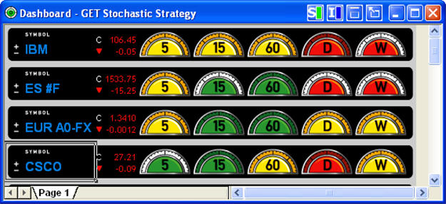
The Dashboard window displays colored gauges on the right hand side that indicate the status of a strategy for periods ranging from 5, 15 and 60 minutes, and daily, weekly, monthly default time frames. The window also has text boxes on the left to enter symbols. When you double left-click on a gauge, a chart with the relevant time frame and the studies associated with strategy being monitored by the Dashboard will be displayed. More than one Dashboard can be on a Page, however only one Dashboard Strategy can be used on that Page.
Editing Time Interval Gauges
Starting with Advanced GET RT version 10.1 (download it here), the default gauges of 5, 15, 60, D and W can be changed to different time intervals by right-clicking on any gauge on the Dashboard. The following menu will appear: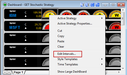
Left-click on Edit Intervals at the top of the menu and the following box will appear: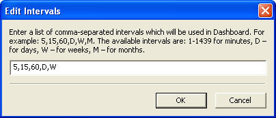
Add or remove the time intervals desired and click OK.
Selecting Dashboard Strategies
The first time you open the Dashboard, the default Strategy will be GET Stochastic. Every subsequent time you open the Dashboard, the last Strategy used will be applied.
You can change the Dashboard Strategy by left-clicking the Dashboard Strategy > Active Strategy selection on the menu bar and selecting the desired strategy.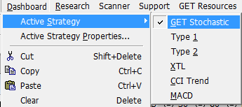
CCI Trend Strategy: It is used to indicate the trends by using the Commodity Channel Index (CCI). The Commodity Channel Index (CCI) is a price momentum indicator that measures the price excursions from the mean price as a statistical variation. The CCI Trend Strategy works best on strongly uptrending or downtrending markets.
If a Dashboard gauge is green in color, then the trend is up. If a Dashboard gauge is red in color, then the trend is down. If a Dashboard gauge is yellow in color, the state is neutral, as there is no perceived trend. If there is not enough data, then the gauge will be gray with a white rim.
GET Stochastic Strategy: The GET Stochastic Strategy is designed to indicate when the market is overbought or oversold. The False Bar indicates the presence of a strong trend and that the standard overbought and oversold signals should be ignored.
If a Dashboard gauge is green in color, then the market is considered oversold. If a dashboard gauge is red in color, then the trend is considered overbought. If a dashboard gauge is yellow in color, the market is between the overbought and oversold levels, therefore, neutral. If a green or red gauge has a white rim (as shown below), a False Bar is present and the current gauge signal should be ignored.
| |
|
MACD Strategy: The MACD consists of an oscillator that is the difference between two exponential moving averages and a moving average of that oscillator. It can be displayed as two lines representing the oscillator and its moving average or as a histogram showing the difference between the oscillator and its moving average.
If a Dashboard gauge is green in color, then the histogram is above the zero line. If a Dashboard gauge is red in color, then the histogram is below the zero line. There is no yellow gauge associated with this strategy.
Type 1 Strategy: Is a trend-following strategy used for considering taking a position at the end of a Wave 4 Retracement in the direction of the current trend. Four parameters must be met for this strategy: (1) Wave 4 is completed; (2) the Elliott Oscillator has pulled back a minimum of 90% and a maximum of 140% of its peak during Wave 3; (3) the PTI is greater than 35; (4) Wave 4 Channel Lines have not been exceeded.
If a Dashboard gauge is green in color, then the parameters for long position have been met. If a Dashboard gauge is red in color, then the parameters for short position have been met. If Dashboard gauge is yellow in color, then the Type 1 Strategy parameters have not been met.
Type 2 Strategy: Is trend-reversal strategy for considering taking a position in the opposite direction of a completed trend. Two parameters must be met for this strategy: (1) Wave 5 is completed; (2) there is a divergence of the Elliott Oscillator between the Wave 3 peak and Wave 5 peak.
If a Dashboard gauge is green in color, then the parameters for long position have been met. If a Dashboard gauge is red in color, then the parameters for short position have been met. If Dashboard gauge is yellow in color, then the Type 2 Strategy parameters have not been met.
XTL Strategy: The XTL (eXpert Trend Locator) is a Strategy the indicates whether the market is trending up or down, or is in a non-trend mode. It uses a statistical evaluation of the market to tell the difference between random market swings (noise) and directed market swings (trends).
If a dashboard gauge is green in color, then the trend is up. If a dashboard gauge is red in color, then the trend is down. If a dashboard gauge is yellow in color, the state is neutral, as there is no perceived trend. If there is not enough data (see Period in the Properties, below), then the gauge will be gray with a white rim.
Entering Symbols into the Dashboard
To enter a symbol into the Dashboard, left-click below the word "SYMBOL" and to the right of the ± symbol. This will open a text box, where you enter the symbol that you are tracking. There is a limit to 100 gauges on a Page. Meaning, that you if you only have 2 time intervals, for example, you can monitor up to 50 symbols on one or more Dashboards on a Page.
Once you have entered the symbol(s) you wish to track, the different gauges will light up red, green or yellow signifying the state of the market according to the selected Dashboard strategy, as explained above.
Displaying a Chart for a Dashboard Symbol
To display a chart for a symbol entered in a Dashboard window, double left-click on the gauge for the time frame desired. A chart will appear with the relevant Dashboard Strategy studies for the time selected.
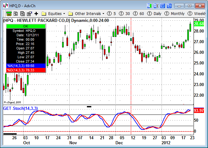
For example, double left-clicking on the red colored daily gauge for HPQ displays the following chart: