Arps Autodivergence Tool
Arps Bear Flag (New in eSignal 11.5)
Arps Bull Flag (New in eSignal 11.5)
Arps Fear-Greed Index (Radar 1)
Arps Floor Pivots Daily/ Weekly/ Monthly
Arps Hurst Bands
Arps Price Leader Acceleration Oscillator (Radar 2)
Arps Price Magnets
Arps Pro-Mom Trend-Bars
Arps Pullback 23 (New in eSignal 11.5)
Arps Range Finder
Arps SuperPaint Permission Screen
Arps Trend Index (Radar 3)
Arps Trend Exhaustion 1 (R2) (New in eSignal 11.5)
Arps Trend Exhaustion 2 (EMRY) (New in eSignal 11.5)
Arps Trend Exhaustion 3 (GD) (New in eSignal 11.5) Arps Trender Pullback Tool
Arps Trender
Arps Triple Trender
Arps Universal Swing Tool
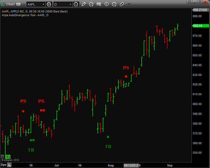
Summary of divergence types:
Pivot Buy Divergence = higher oscillator valleys, lower price lows
Pivot Sell Divergence = lower oscillator peaks, higher price highs
Trend Sell Divergence = higher oscillator peaks, lower price highs
Trend Buy Divergence = lower oscillator valleys, higher price lows
ps = pivot sell divergence
pb = pivot buy divergence
ts = trend sell divergence
tb= trend buy divergence
Inputs
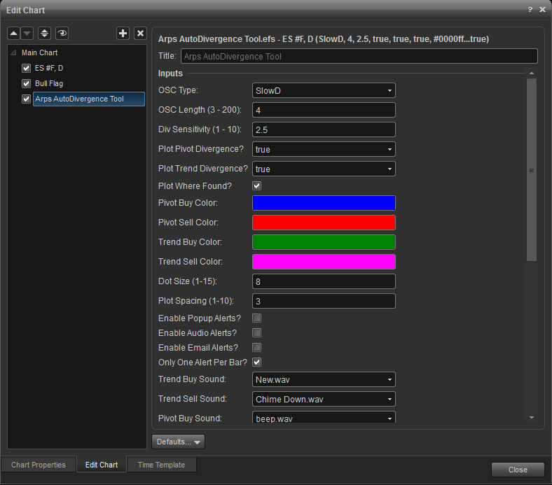
osc type: (default = slowd) other choices are fastd and arps fear/greed oscillator. click the small down arrow to make your selection.) this input gives you the option to choose among 3 different oscillators to use in the divergence determination. currently, you can choose between 3 oscillator types by entering a 1, 2, or 3. OSC Length: (Default = 4 for SlowD, FastD and Fear/Greed) This input sets the “length” or “sensitivity” input for the oscillator you specify. Generally, the higher you make this value, the larger will be the trends the oscillator reveals.
Arps Bull & Bear Flag Patterns
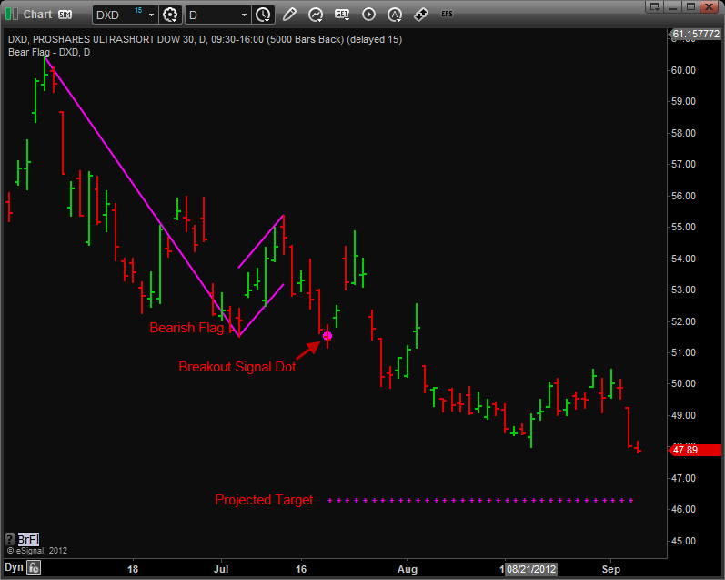
Many times a trending market will pause from its major trend to form a short-term correction pattern known as a “flag” pattern. Flag patterns can be subdivided into Bull Flags, a consolidation in an uptrend, and Bear Flags, a consolidation in a downtrend. These patterns usually form near the midpoint of a steep, quick price trend. The Arps Flag Pattern tools highlight bull and bear flag patterns that will help you to find potentially profitable breakouts from trend consolidation formations.
When selecting a flag pattern to trade, it is important to select flags that form after a large, quick price move. If prices are meandering up or down and form a flag, then look elsewhere. The flag must be at a place where the market can take a breather from a rapid trending move. Prices will then move against the main trend for several bars before continuing on. Flags are usually half-mast trades in strong trends. They generally form in the center third of the range of the larger trend. In other words, Flags usually show rises that almost exactly match the gain leading to the formation. This tendency provides the trader with the opportunity to put on a relatively low-risk trade with a potential profit target from the bottom of a bull flag to a point equal to the length of the flagpole.
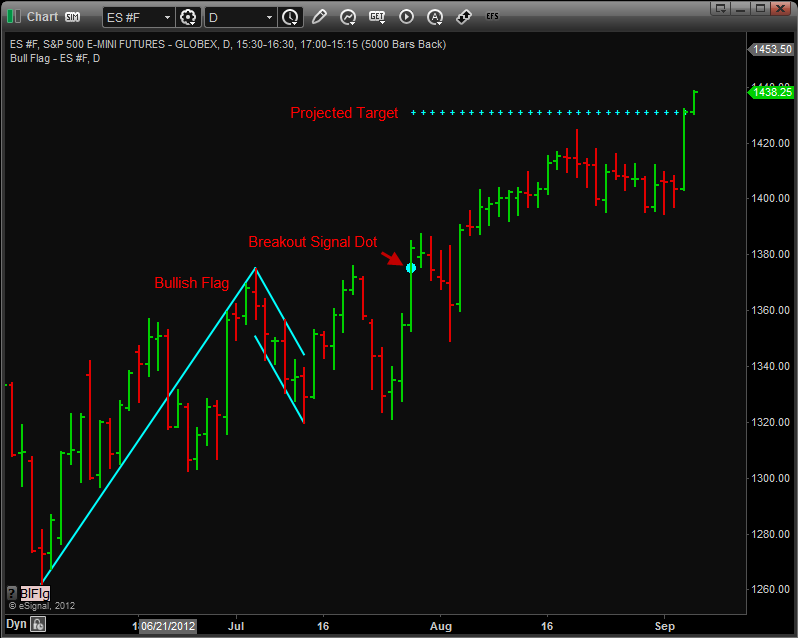
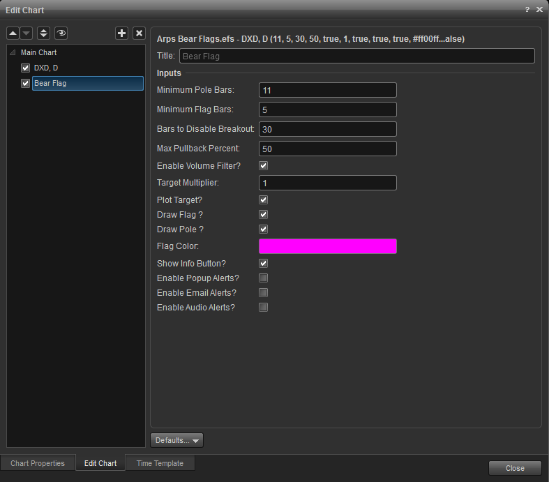
Minimum Pole Bars: The minimum number of bars in a flagpole. Typically, the number of bars in the flag portion of the pattern (Minimum Flag Bars) should be no less than 4 and no more than 8.
Minimum Flag Bars: The minimum number of bars in a flag. The flagpole should have at least 7 bars, but in all cases Minimum Pole Bars should be greater than Minimum Flag Bars. A Minimum Pole Bars setting of 12 or so works well in smaller time frames.
Bars to Disable Breakout: If a breakout doesn’t occur within this number of bars after the flag has been identified, the flag breakout is no longer valid.
Max Pullback Percent: The number of points in the pullback from the flag high to the flag low cannot exceed this percent of the length of the pole, i.e., maximum percentage retracement of flag to flagpole. The Max Pullback Percent is defaulted to 50%. Reducing the Max Pullback Percent to 35 percent or so will filter out many potential flag patterns
Enable Volume Filter?: When checked, it turns on an additional filter to require the volume in at least one bar of the flag pullback to be lower than the average volume over the last 50 bars. (The volume nearly always recedes over the course of a flag formation.)
Arps Fear-Greed Index (Radar1)
This study creates a histogram based on the relationship between price changes and volume changes to measure the ratio of buying strength to selling strength. The length and color of the histogram bars tell us whether the Bulls or the Bears are in control at any particular point in time. It is an excellent oscillator for divergence analysis and for identifying trend persistence and works in real time on charts in any time frame, either intraday or end-of-day.
When the Arps Fear/Greed Index is in the green zone, buying pressure exceeds selling pressure and the Bulls are in control. The height of green upward-pointing histogram bars is an indicator of the strength of the Bulls’ buying pressure. Conversely, if the Arps Fear/Greed Index histogram is in the red zone, selling pressure exceeds buying pressure and the Bears are in control. The depth of the red downward-pointing histogram bars is an indication of the strength of the Bears’ selling pressure.
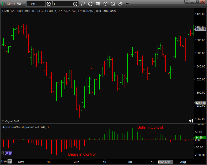
The Arps Fear/Greed Index serves as an excellent turning point indicator in all kinds of markets because it usually begins to turn before the price does. It generally reveals the exhaustion of the Bulls/Bears while the price is still moving up/down of its own momentum. If a sudden move in price is not confirmed or anticipated by a similar move in the Arps Fear/Greed Index, it usually means a fake-out swing and represents a move to be ignored or faded.
The Arps Fear/Greed Index often creates a characteristic "double peak" or "double valley" pattern prior to a major price reversal. On the other hand, if the pattern is a smooth up-and-down curve interrupted with no more than a minor dip, the chances are that the existing trend will continue further.
When an Arps Fear/Greed Index valley is shallower than its predecessor while the price corresponding to the most recent Arps Fear/Greed Index valley is lower than the price corresponding to the previous Index valley, a diverging condition has occurred that generally signals an imminent price reversal to the upside. Conversely, when a the Arps Fear/Greed Index peak is lower than its predecessor while the price corresponding to the most recent Index peak is higher than the price corresponding to the previous Index peak, a diverging condition has occurred that generally signals an imminent price reversal to the downside.
This index often exhibits a typical pattern behavior of twin peaks or valleys. When you see a single substantial peak or valley, be prepared to see its "twin" appear after a brief pullback.
The Arps Fear/Greed Index is an extremely robust indicator that works equally well on end-of-day data and intraday data.
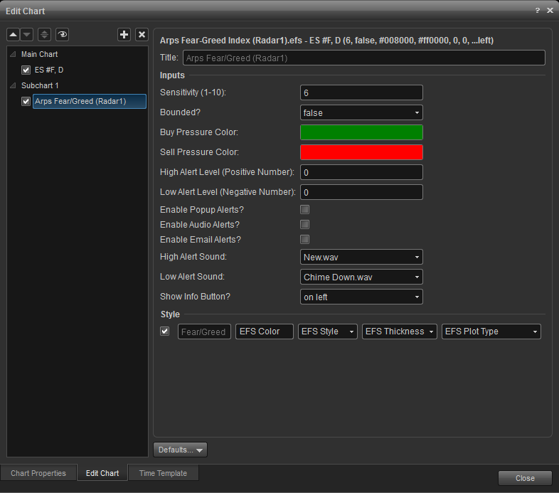
Sensitivity: (Default = 4 Range 1-10) Lower numbers make the indicator more sensitive, meaning changes in price action will affect this indicator more rapidly. The optimum value for this input factor will vary from market to market and time frame to time frame. You will be able to use the Fear/Greed Index most effectively by tailoring this input factor to the chart you are evaluating. It was designed to give you the maximum control over the market trends you are most interested in.
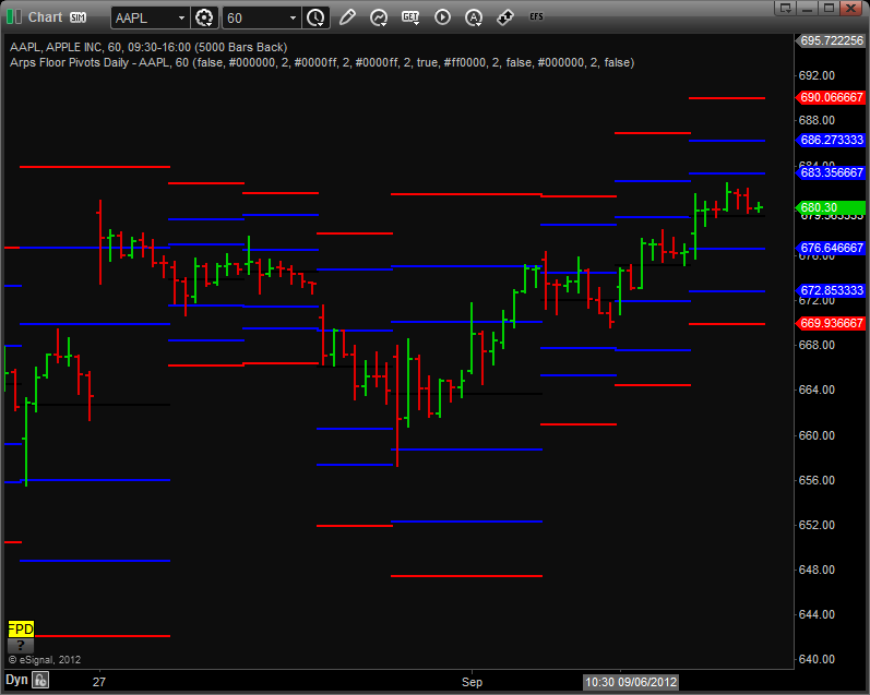
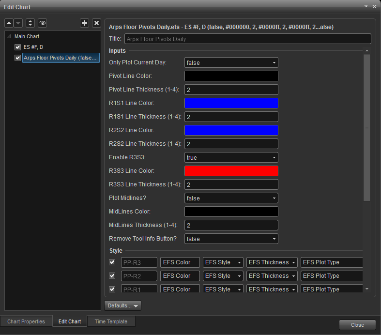
Arps Floor Pivots Daily/ Weekly/ Monthly Support-Resistance Lines
Avg Price = (H+L+C)/3
Resistance 2 = Avg Price + H - L;
Resistance 1 = 2*Avg Price - L;
Support 1 = 2* Avg Price - H;
Support 2 = Avg Price + L - H;
Since the “Secret” Floor Pivot formulas have become common public knowledge, they have also become self-fulfilling prophecies and other traders have begun to “gun” for them.
Research at Jan Arps’ Traders’ Toolbox has shown that not only do the Pivot Point calculations work well for intraday price action, but they also have been found to be quite effective over larger time frames, such as daily, weekly and monthly charts, to pinpoint potential support and resistance levels. Research has also shown that the midpoints between the classic support/resistance lines have become very significant support and resistance levels.
Accordingly, the Arps Pivot Points Monthly, Arps Pivot Points Weekly, and Arps Pivot Points Daily indicators were developed to provide the user with a set of guidelines for the expected price range over the current monthly/weekly/daily period. Increased potential for price support or resistance occurs at levels of confluence of the pivot lines for the different time frames.
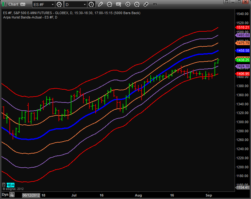
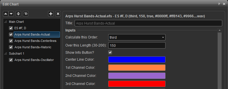
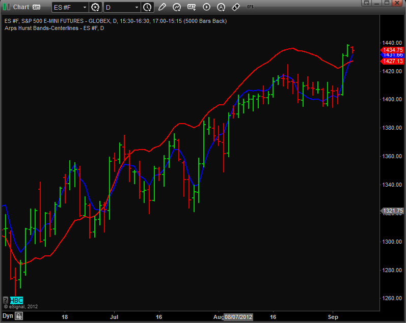
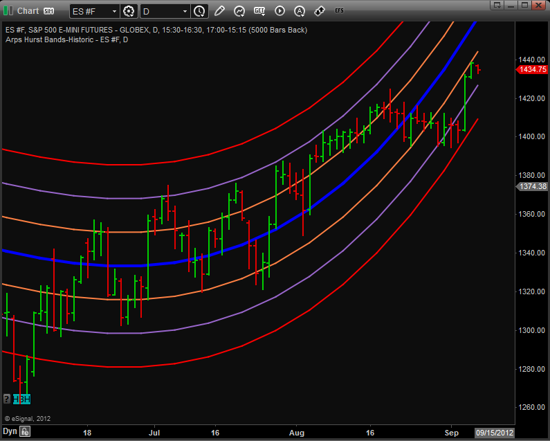
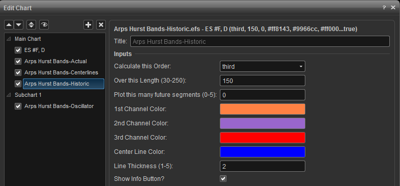
This indicator plots a series of support and resistance channel lines around a polynomial regression centerline. The formula for the centerline takes the form, a + bx +cx2 + dx3 + ex4 …. The Arps Hurst Bands are spaced so that each channel represents one-half sigma, or standard deviation.
Prices tend to regress toward the mean, which is represented by the blue centerline on the Arps Hurst Bands chart. It has been observed that when prices cross outside the outer boundaries of the Arps Hurst Bands they almost invariably return to the centerline (reversion to the mean).
The three curvilinear bands above and below and paralleling the centerline represent one, two and three sigma (standard deviations) of the closing prices from the mean centerline. There is only a five-percent chance that prices will exceed the 2-sigma, and less than a one-percent chance that they will exceed the 3-sigma line. So, when prices reach these bands, a relatively low-risk entry opportunity presents itself to trade in the opposite direction of the current move.
Arps Hurts Bands - Actual
As you watch the Arps Hurst Bands in action on a real-time chart, you will see that the shape of the bands changes on each bar as the first bar of the previous bar’s regression calculation is dropped from the calculation and the new bar is added into the calculation. Thus, the Arps Hurst Bands – Actual indicator plots the progress of the end point of the Arps Hurst Bands – Historic indicator for each bar on the chart. Thus the Arps Hurst Bands - Actual indicator permits a continuous evaluation of how the relationships of the sigma standard deviation bands changed with time and how the end points looked at the time that particular bar was the last bar on the chart.
If you overlay the Arps Hurst Bands-Historic indicator with the Arps Hurst Bands-Actual indicator, both with the same settings, you will see that the value of the Historic lines on the last bar of the chart will match exactly the value of the corresponding Actual lines on the last bar. In effect, the Arps Hurst Bands - Actual indicator represent a “trail of crumbs” showing where the Arps Hurst Bands-Historic were when each bar was the last bar on the chart. The usefulness of this indicator is to show how the Arps Hurst Bands calculations have behaved in the past as the regression channels are recalculated on every bar.
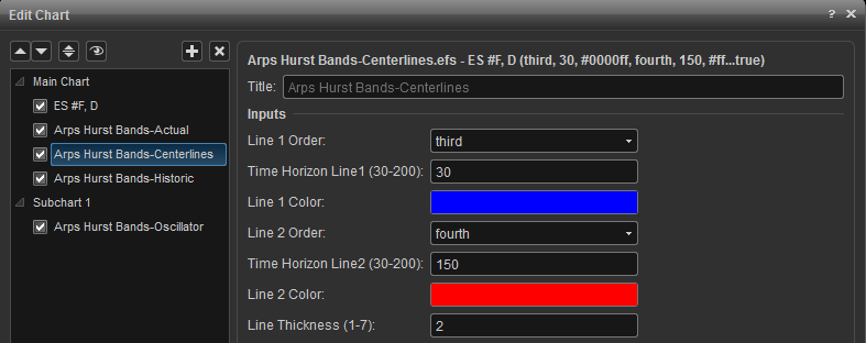
Arps Hurst Bands - Centerlines
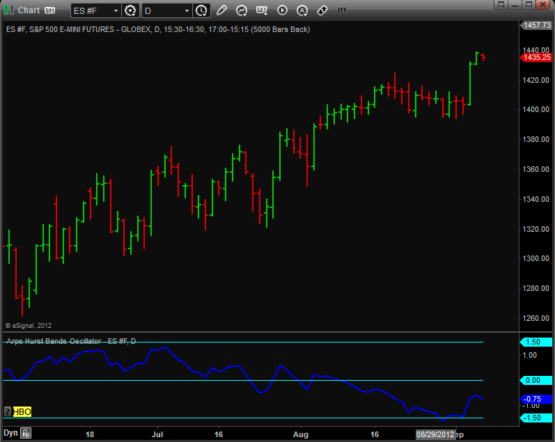
The Arps Hurst Bands Oscillator indicator, shown as the oscillator in the lower portion of the price chart below, plots on a straight-line scale the relationship between the price and the Arps Hurst Bands – Actual. The band lines above and below the oscillator represent the “straightened out” 3-sigma channel boundaries, while the centerline represents the “straightened out” centerline. The purpose of this indicator is to normalize the price in terms of standard deviations from the centerline, thereby displaying when prices are overbought or oversold.

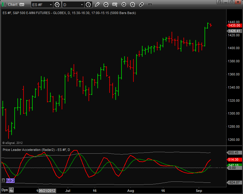
When the Arps Price Leader Acceleration Oscillator (Radar 2) is above the 50 center line, it means that price is still accelerating to the upside. When the Arps Price Leader Acceleration Oscillator (Radar 2) crosses below the 50 center line, it means that price acceleration has reversed and the momentum is now slowing. The greater the prior excursion away from the center line, the stronger the price move will be in the opposite direction when the Arps Price Leader "slingshots" back across the center line. A curling over of the Fast Price Leader line and a subsequent crossing of the Slow Price Leader line are indicative of an impending turn in the price trend. You will also frequently see a characteristic "mini double top/bottom" in the Fast Price Leader line over a 3- to 6-bar interval, which usually is the precursor to a significant reversal in trend.
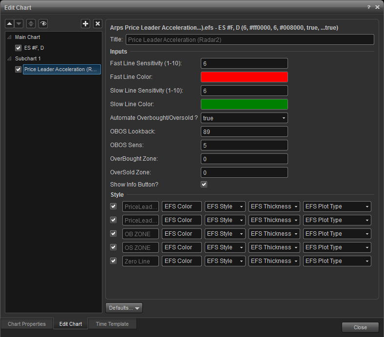
Fast Line Sensitivity: (Default = 6, Range = 1-10)
Slow Line Sensitivity: (Default = 6, Range = 1-10) This input controls the sensitivity of the slow Price Leader line. Higher numbers flatten the line and increase the spread between the fast and slow lines.
Arps Price Magnets
One of the most effective tools for generating support/resistance levels is the Arps Price Magnets Up/Down set of indicators. These indicators are based on a revolutionary new concept developed by Jan Arps’ Traders’ Toolbox to define price projection zones based on price swing analysis. The indicator is fully automatic and plots on the price chart a set of horizontal lines that define significant future support/resistance targets based on price patterns generated by previous swings.
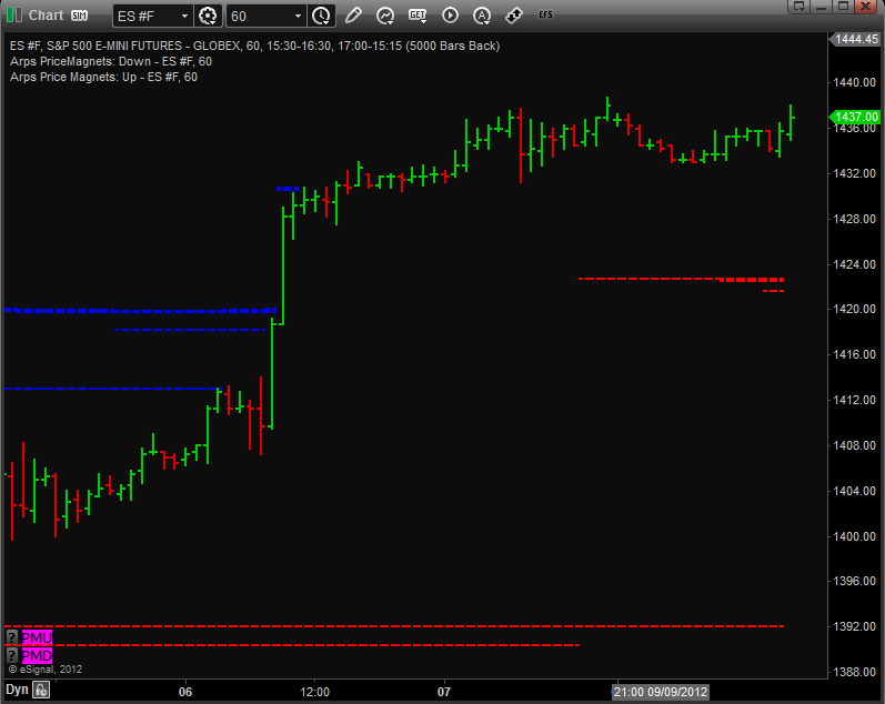
In the example shown above, the blue lines are Price Magnets Up and the red lines are Price Magnets Down. Observe where the lines began plotting. This is the point in time where the Price Magnets algorithm calculated the location of the next Price Magnets support/resistance level. Notice also how Price Magnets cluster, showing strong support or resistance at that level.
Inputs
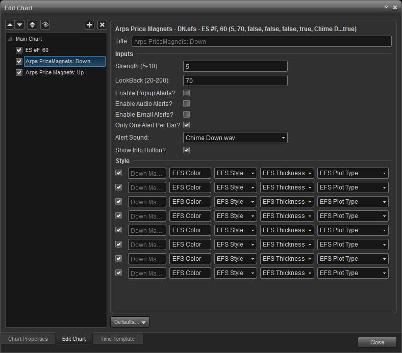
Strength (Default = 5, Range = 1-10) This input defines the magnitude of the swings to be used in establishing the Price Magnet targets, and, therefore, the sensitivity of the Price Magnets indicator. The larger the Strength input value, the more significant the price swing needs to be to establish a new Price Magnet line. Higher values will produce magnets that correspond to longer-term trends, and you will probably see fewer of them. Some users prefer to run the Price Magnets indicator more than once on the same chart using different Strength values and different colors for the target lines in order to see both the major and minor price targets.
Lookback(Default = 70, Range – 20-200) This input defines the interval (in number of bars) over which the indicator will search for the price swing pattern that will define the target zone. The total number of bars on the chart should be no less than approximately 8 - 10 times the value of Lookback.
Normally, a little experimentation will be necessary to establish the optimum values for Strength and Lookback for each chart window. The default Lookback value is set for 70 bars, but, if you have a daily or weekly chart with less than 300 bars, you should reduce the Lookback value.
arps pro-mom trend-bars
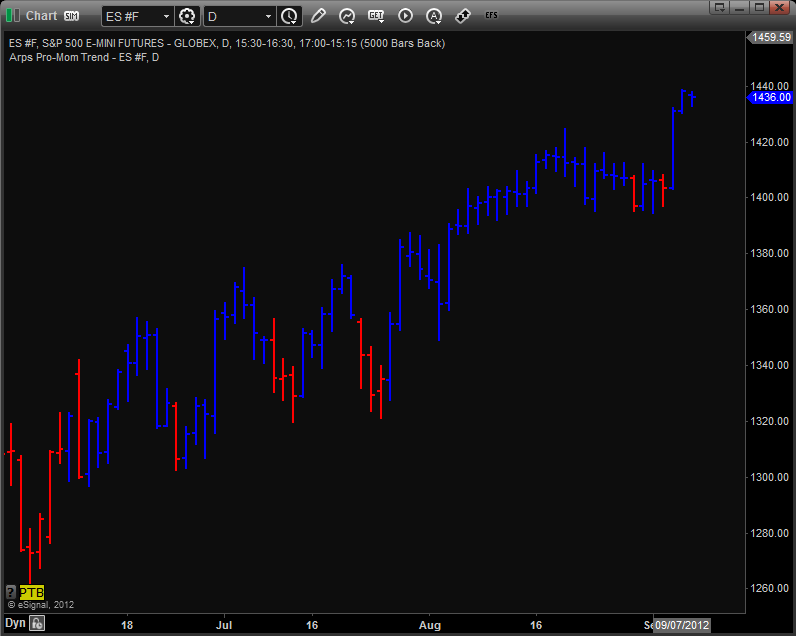
this set of enhanced trend bar studies is highly accurate in revealing the overall trend direction. when the bars are painted blue, an uptrend is underway. when the bars are painted red, a downtrend is underway. the greater the number of consecutive bars painted, the more reliable is the trend detection on any time frame. when alternating clusters of red and blue bars appear, it suggests a sideways market with no real trend.
.
inputs
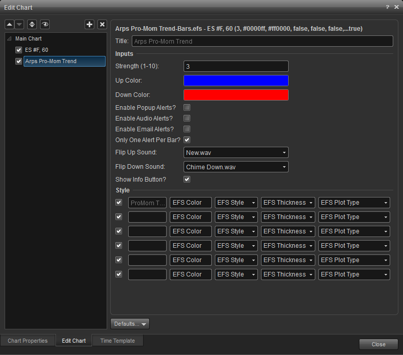
strength: (default = 3, range = 1-10) the higher you make this value, the stronger will be the trends it reveals. the optimum value for this input factor will vary from market to market and time frame to time frame. you will be able to use the pro-mom trend bars most effectively by tailoring this input factor to the chart you are evaluating. it was designed to give you the maximum control over the market trends you are most interested in.
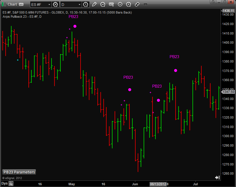
There are four primary input parameters which should be harmonized with the chart resolution and volatility of the markets you are studying. They are all different forms of sensitivity and can be adjusted like the equalizer on your sound system. The Treble input represents the higher frequencies to be monitored while the Bass setting looks at lower frequencies; and thereby adjusts how often, how timely, and how reliable the signals are apt to be. Lower numbers in the Bass setting will provide quicker, more frequent, and slightly less reliable signals. The Tempo setting will adjust the time oscillations used in this study; and the Chromatic setting fine tunes the tool to its optimal relationship to the chart being examined.
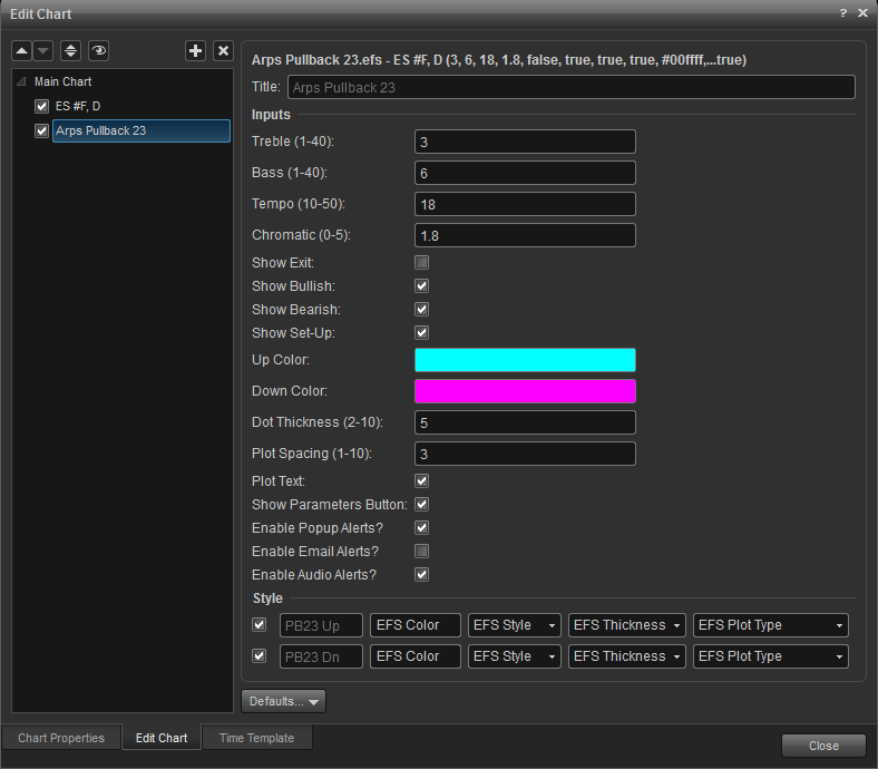
Treble: (1-40) Lower numbers provide quicker indication.
Bass: (1-40) Higher numbers provide later but more reliable signals.
Tempo: (10-50) Lower numbers will generally find fewer but more reliable opportunities.
Chromatic: (0-5) Don't be afraid to fine tune this one with decimals.
Show_Exit: Check if you want the tool show you the exit signals for this setup.
Show_Bullish: Check to show bullish signals
Show_Bearish: Check to show bearish signals
Show_Setup: Check to plot signals on your chart
Up Color: (blue) Choose any color name your charting platform recognizes.
Down Color: (red) Choose any color name your charting platform recognizes.
Arps Range Finder
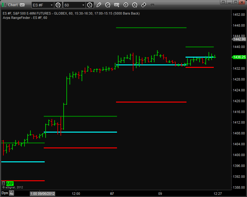
This powerful analysis tool gives the user an immediate indication at the day’s Open whether the day is likely to be an "Up" day, a "Down" day or a "Sideways" day.
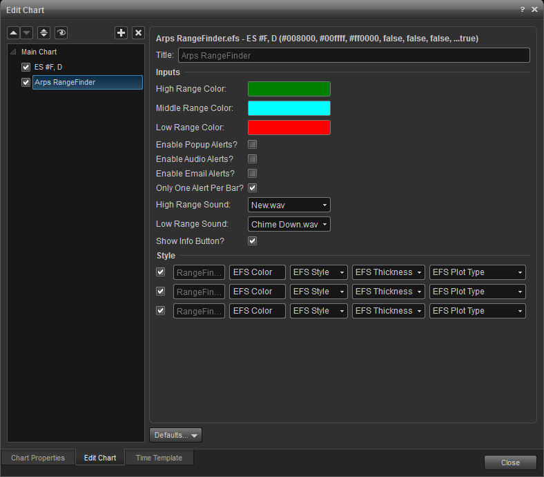
The Arps RangeFinder draws a set of three horizontal lines on an intraday chart. These lines consist of a green High Support line, a red Low Resistance line and a cyan Daily Midline. If the price opens above the High Support line, we can assume that today will be an upward-trending day and that the High Support line will serve as a support level for prices during the day. Conversely, if the price opens below the Low Resistance line, we can assume that today will be a downward-trending day and that the Low Resistance line will serve as price resistance. If the price opens between the two lines, the lines will define the expected trading range for the day.
Many first-time users believe these tools represent an accurate projection of what tomorrow’s trading range will be. This is not necessarily the case. Instead, what is important is to observe how the price trades during the day with respect to these support/resistance lines. If price opens above the High Support Line, then subsequently makes a significant break below this line, there is a high probability that prices will continue to decline all the way to the Low Resistance Line. Conversely, if the price opens below the Low Resistance Line, then subsequently makes a significant break above this line, there is a high probability that prices will continue to rise all the way to the High Support Line.
Arps Super Paint Permission Screen
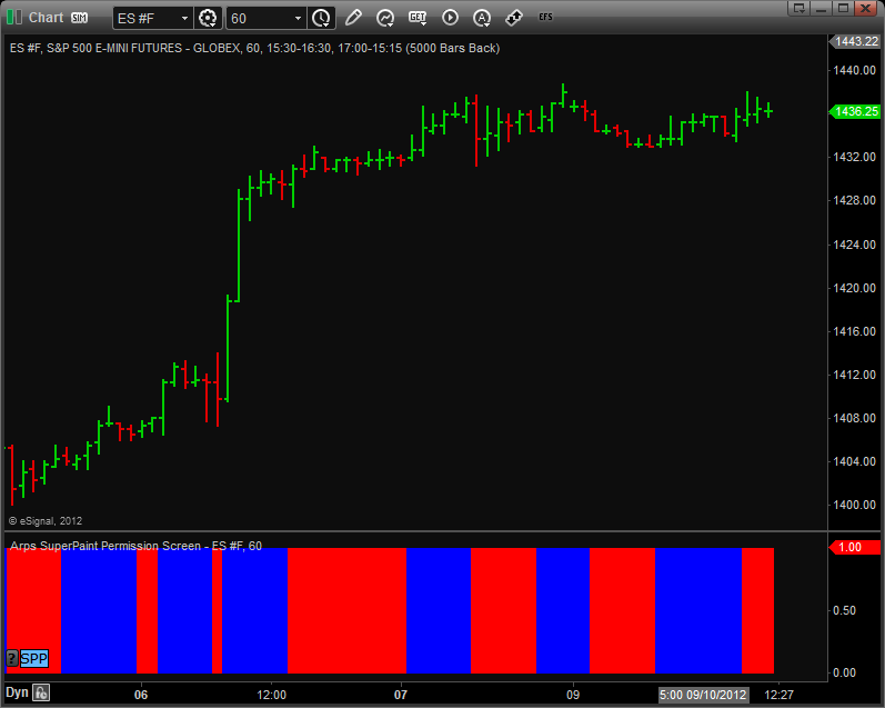
The Arps SuperPaint Permission Screen tool is used as a confirming indicator in conjunction with other tools to give an indication as to when it is advisable to take a long or short position. When the permission screen is blue, only buy signals should be considered. When the permission screen is red, only sell signals should be considered.
Inputs
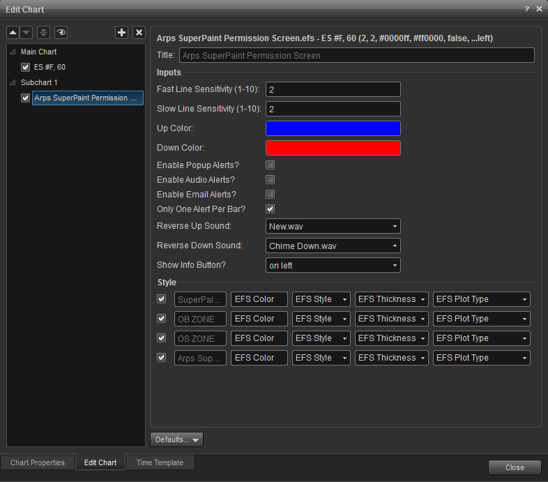
Fast Line Sensitivity: (Defaut = 2, Range = 1-10) Higher numbers cause color changes to occur more slowly.
Arps Trender and Trender Pullback Tool
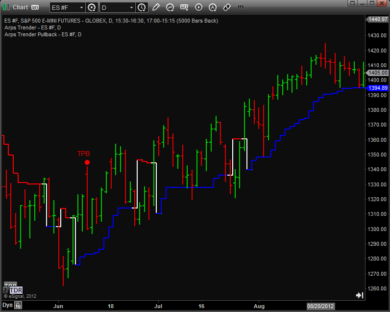
The Arps Trender is a powerful indicator that keeps you in the trend. When the trend is up, the Arps Trender plots a blue line below the price bars. When the trend is down, it plots a red line above the price bars. Notice how closely the Trender follows the price while giving it enough room to swing without triggering a Trender reversal until the trend has completed its run.
Inputs
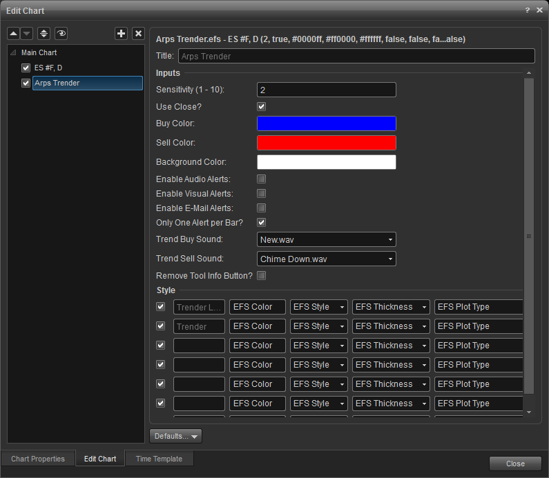
sensitivity: (default = 2, range 1-10) this input controls the sensitivity of the arps trender lines. a value of 1 is most sensitive, reflecting more short-term trend changes while a higher value is less sensitive, better reflecting the longer-term trend.
Arps Trend Exhaustion 1 (R2)
The Arps Trend Exhaustion 1 (R2) tool uses the Arps Radar 2 Price Acceleration Oscillator to study the nature of price action to recognize internal signals which often lead to price reversals on the chart. One of Jan Arps' most popular tools, Radar 2 is based on a proprietary algorithm which looks for subtle changes in the behavior of the price to detect changes in strength or weakness of the trend, which is confirmed by a cross of the FastLens and SlowLens lines. TE-1 can also be successfully utilized in the manner of many typical oscillators, by monitoring for a cross below or above dynamic overbought or oversold zones. When such conditions exist this Trend Exhaustion tool plots a dot above or below the price and, like all of the Arps Trend Exhaustion tools, it can also send you an alert when it has recognized such an opportunity.
When the input parameter “Use_Overbought/Oversold Cross?” is checked then the tool will automatically calculate dynamic overbought and oversold lines based on the volatility of the indicator over a user defined lookback period. When that parameter is NOT checked, then you can manually input your own Price Leader levels to define the overbought and oversold zones.
Since this tool is based on our Radar2 Price Acceleration indicator the “warning” signal is generated when the fast line converges toward the slow line. In order to generate a warning signal using
OBOS mode, the fast line must be beyond the OBOS threshold and converging toward that threshold. If the fast line crosses the slow line before the fast line crosses the OBOS threshold, the tool will generate signals on the earlier cross of the oscillator lines.
1) Generate signals on automatically calculated OverBought/OverSold Zone crosses - check both the “Use_Overbought/Oversold Cross?”, and the “Automate Overbought/Oversold” .
2) Generate signals on manually calculated OverBought/OverSold Zone crosses - check the “Use_Overbought/Oversold Cross?”, and do not check the “Automate Overbought/Oversold” . Now you can manually input the OB Zone and OS Zone levels of your choice. Zero is a good option for this because it will provide signals when the fast Price Leader fast line moves from acceleration to deceleration.
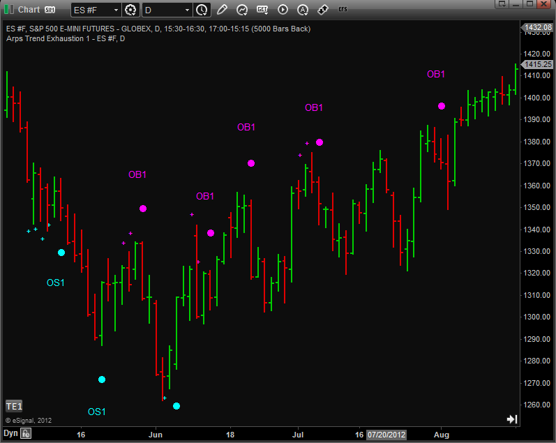
Inputs
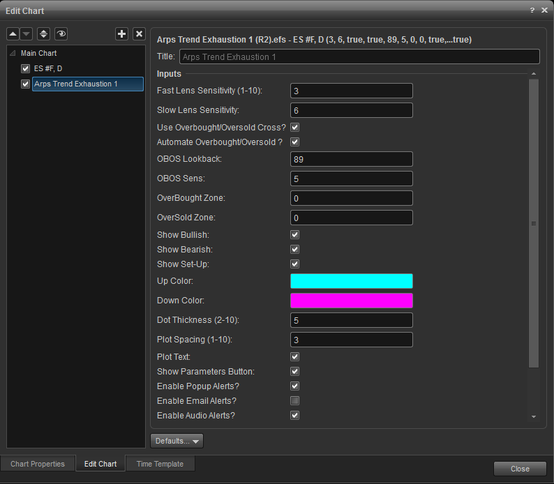
Fast Lens Sensitivity: (1-10) The Fast Lens of the Radar2 Price Leader. The higher the setting the fewer and later the dots.
Slow Lens Sensitivity: The Slow Lens of the Radar2 Price Leader. Lower settings tend to create more frequent signals.
Use_Overbought/Oversold Cross?: Check if you want to indicate a cross from an overbought or oversold threshold. Uncheck to indicate turning points in the oscillator.
Automate Overbought/Oversold?: Check to have automatic calculations of the OB and OS thresholds. Uncheck to input your own values for the OB and OS zones.
OBOS Lookback: The lookback period for the automatic OBOS calculations.
OBOS Sens: Sensitivity setting for the automatic OBOS calculations. Higher numbers will cause the OBOS zones to be farther away.
OverBought Zone: (0 to 300) Indicates the overbought threshold. Leave blank when using the Automate OBOS_Zones. Input a number of your choosing when not using the auto OBOS zone calculator.
OverSold Zone: (0 to -300) Indicates the oversold threshold.
Show_Bullish: Set to true to display bullish signals
Show_Bearish: Set to true to display bearish signals
Plot Spacing: (1-10) Smaller numbers plot the dot closer to the high or low of the bar generating the signal.
Dot Size: (1-10) Allows you to adjust the way the signal dot looks on your chart.
Plot text: check to display signal text on chart
Up Color: (green) Use a color name your platform recognizes.
Down Color: (red) Use a color name your platform recognizes.
Early Warning System Component
This tool looks for Trend Exhaustion 2 signals identified by specific price patterns. When some but not all of the conditions of those price patterns come about, the tool will generate a “warning” signal.
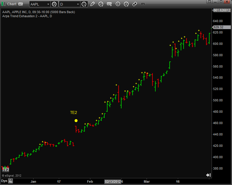
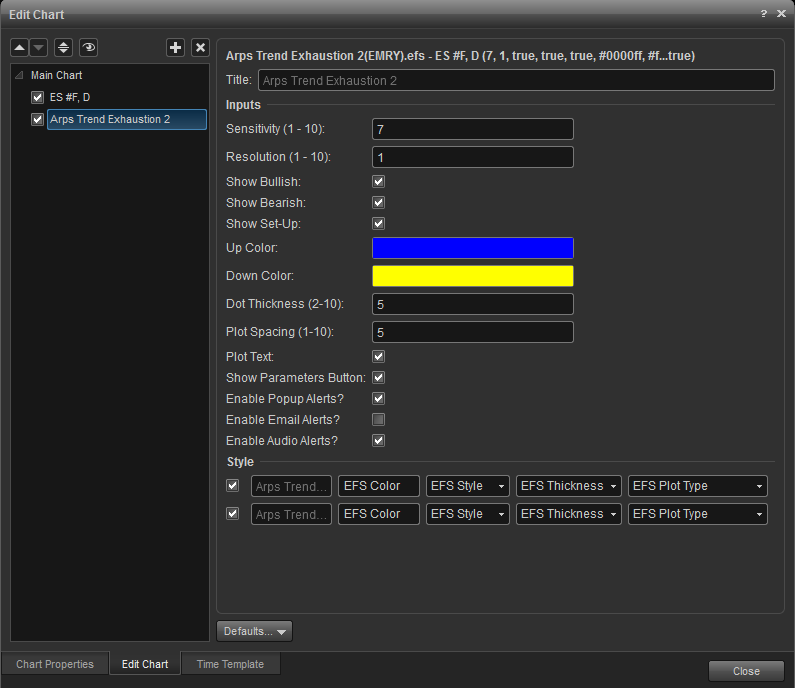
Sensitivity: (1-10) Lower numbers usually plot more signals.
Resolution: (1-10) Generally lower numbers work better in trending markets and higher numbers in choppy markets.
Show_Bullish: Check to display bullish signals
Show_Bearish: Check to display bearish signals
Show_Setup: Check to display indicator signals
Up Color: (blue) Use a color name your platform recognizes.
Down Color: (magenta) Use a color name your platform recognizes.
Plot Spacing: (1-10) Smaller numbers plot the dot closer to the high or low of the bar generating the signal.
Dot Size: (1-10) Allows you to adjust the way the signal dot looks on your chart.
Plot text: check to display signal text on chart
Arps Trend Exhaustion 3 (GD)
The Arps Trend Exhaustion 3 tool takes a look at the market through the filter of several different concomitant proprietary analytical techniques, and plots its signals when enough of the indications agree on the likelihood that the current bar represents significant trend exhaustion. This tool is particularly adept at identifying possible swing points in real time providing you with timely exit warnings in trending markets.
This tool looks for a confluence of chart patterns and indicator conditions. When some but not all of the requirements for the indicator conditions are met, then the tool will plot a 'warning' signal in anticipation of the fulfilled Signal Dot conditions.
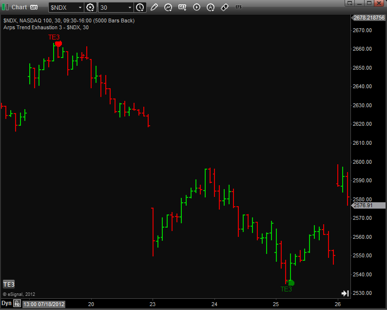
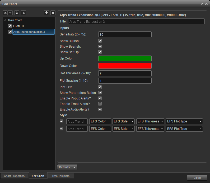
Sensitivity: (2-75) Typically lower numbers will produce fewer signals in a trending market.
Show_Bullish: Check to display bullish signals
Show_Bearish: Check to display bearish signals
Show_Setup: Check to display indicator signals
Plot Spacing: (1-10) Smaller numbers plot the dot closer to the high or low of the bar generating the signal.
Dot Size: (1-10) Allows you to adjust the way the signal dot looks on your chart.
Plot text: Check to display signal text on chart
Arps Trend Index (Radar 3)
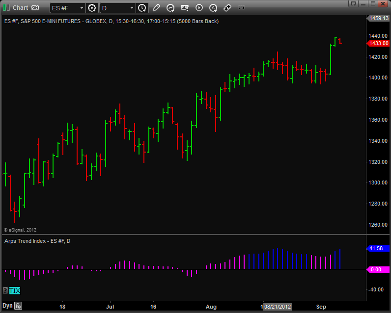
This powerful oscillator from Jan Arps’ Traders’ Toolbox has been designed to give the user the clearest possible insight into the direction of the overall trend. The plot is displayed as a magenta/blue histogram. When the bars are blue and above the centerline, the trend is up. Magenta bars above the centerline indicate a pullback in an uptrend. When the bars are magenta and below the centerline, the trend is down. Blue bars below the centerline indicate a pullback in a downtrend. This is a very robust indicator that works across all time frames.
 .
. 
sensitivity: (2-75) typically lower numbers will produce fewer signals in a trending market.
show_bullish: check to display bullish signals
show_bearish: check to display bearish signals
show_setup: check to display indicator signals
plot spacing: (1-10) smaller numbers plot the dot closer to the high or low of the bar generating the signal.
dot size: (1-10) allows you to adjust the way the signal dot looks on your chart.
plot text: check to display signal text on chart

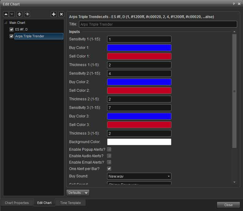
The sensitivities of the Triple Trender lines can be changed by modifying the Sensitivity 1, Sensitivity 2 and Sensitivity 3 Inputs.
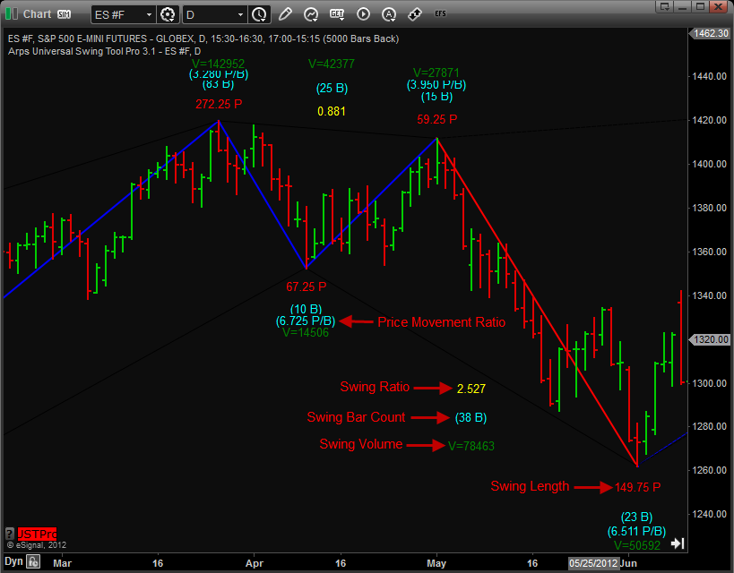
As well as plotting the basic zigzag line, this tool has the additional capability of displaying the following information about the price swings:
2. The ratio of the magnitude of each swing to that of the preceding swing (swing ratios),
3. The longer-term trend direction.
4. Retracement support/resistance levels for the current swing as well as for previous swings,
5. The swing reversal price, that is, the price to which a current swing will have to reverse to constitute a reversal of swing direction.
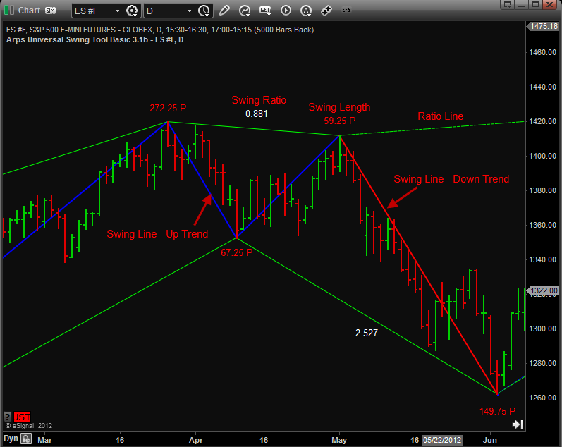
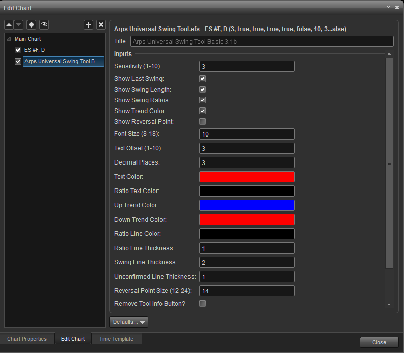
Show Swing Ratios: When checked, the Universal Swing Tool automatically connects adjacent peaks with a straight line and adjacent valleys with a straight line. It then displays on this line the ratio of the vertical lengths of two swings leading from the first peak/valley to the second peak/valley. This number represents the actual retracement ratio of the current swing to the previous swing in the opposite direction. As more fully described in the work by Larry Pesavento, these Swing Ratios frequently occur at common Fibonacci values, and thus can be useful in recognizing and predicting the harmonic relationships from one price swing to the next.
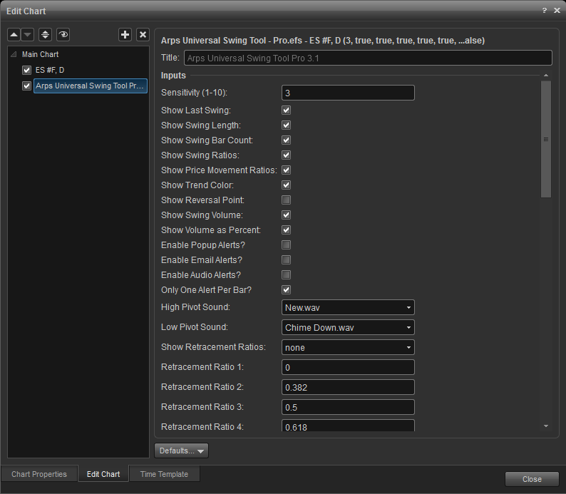
Show Retracement Ratios: When checked, the Universal Swing Tool automatically calculates and plots Retracement levels for the current swing. These retracement ratios are usually Fibonacci ratios, but can be set by the user to be any desired fraction, both greater than or less than 1. Five Retracement Ratio inputs, Retracement Ratio 1 through 5 have been provided as user-controllable inputs. As the swing increases in amplitude, the retracement levels are automatically recalculated and replotted continuously in real time.
Show Reversal Point: When checked, the Universal Swing Tool displays two dots on the last bar of the chart. The dot in the opposite direction of the current swing indicates the price at which, if reached, the swing line will reverse direction. The dot in the same direction as the current swing indicates the price at which, if the existing trend reversed, the trend would reverse back into the original direction.
Inputs
Additional information in regards to the Jan Arps Indicators or Custom Programming, can be found on the Jan Arps' Trader's Toolbox website.