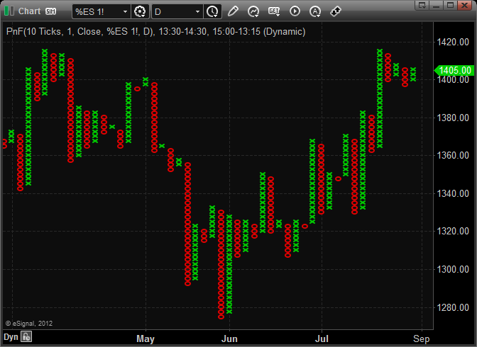
eSignal 12 - Point and Figure Charts
Point and Figure charts differ from traditional price charts in that they completely disregard the passage of time and only display changes in prices. Rather than having price on the y-axis and time on the x-axis, Point and Figure charts display price changes on both axes. This is similar to Kagi, Renko, and Three Line Break charts.
Interpretation
Point and Figure charts display the underlying supply and demand of prices. A column of Xs shows that demand is exceeding supply (a rally); a column of Os shows that supply is exceeding demand (a decline); and a series of short columns shows that supply and demand are relatively equal.
There are several chart patterns that regularly appear in Point and Figure charts. These include Double Tops and Bottoms, Bullish and Bearish Signal formations, Bullish and Bearish Symmetrical Triangles, Triple Tops and Bottoms, etc. It is beyond the scope of this article to fully explain all of these patterns.
Calculation
Point and Figure charts display an "X" when prices rise by the "box size" (a value you specify) and display an "O" when prices fall by the box size. Note that no Xs or Os are drawn if prices rise or fall by an amount that is less than the box size.
Each column can contain either Xs or Os, but never both. In order to change columns (e.g., from an X column to an O column), prices must reverse by the "reversal amount" (another value you specify) multiplied by the box size. For example, if the box size is three points and the reversal amount is two boxes, then prices must reverse direction six points (three multiplied by two) in order to change columns. If you are in a column of Xs, the price must fall six points to change to a column of Os. If you are in a column of Os, the price must rise six points to change to a column of Xs.
The changing of columns identifies a change in the trend of prices. When a new column of Xs appears, it shows that prices are rallying higher. When a new column of Os appears, it shows that prices are moving lower.
Because prices must reverse direction by the reversal amount, the minimum number of Xs or Os that can appear in a column is equal to the "reversal amount."
The common practice is to use the high and low prices (not just the close) to decide if prices have changed enough to display a new box.
Opening a Point and Figure Chart
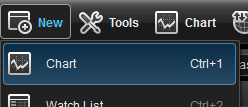
To open a Point and Figure Chart select New from the menu bar and then select Chart.
This will open a New Chart window, to change the chart type right click on the Chart window and select Edit Chart. Inside the Edit Chart window select Point and Figure from the Chart Type drop down menu.
Point and Figure Properties
To access the Point and Figure properties, right click on the chart window and select Edit Chart. Here you can set the Box Size as well as change the Colors for the Chart. You can also enable/disable the different options for the Point and Figure Chart.
Projection: Display where X's and O's would be if the chosen interval closed
Box Size: Price range for each box
Reversal: The amount that a stock needs to move in the opposite direction to warrant a column reversal.
Last Value: Displays the Last Price on the Chart
Visual Fixed Grid: A fixed Scale to keep relationship between time and price equal. When the Visual Fixed Grid is enable adjusting the Time scale will also adjust the price scale.
Highlight Actual H/L: Displays the true High and Low range for that specific period
Show Number of X's and O's: Displays the number of X and O in the column
Month Codes: Displays the Month Code to indicate when a new month has begun
Wyckoff Calculation: When the reversal is set to 1, boxes with just one X or O are stacked with their previous box


