eSignal 10.6 - Market Profile Window
Market Profile is a graphical organization of price and time information. Market Profile displays price on the vertical axis and time on the horizontal axis. Letters are used to symbolize time brackets. marketprofileSM is an analytical decision support tool for traders, not a trading system.
This add-on service ($50 per month) was original designed and copyrighted by the CBOT (now known as the CME Group). While this methodology will work on stocks, it was primarily designed for analyzing futures. To read more about Market Profile, please click here to read the description of this service on the CME Group site.
To add the service to your account, please log-on to Account Maintenance.
There are two training videos available on the Market Profile Window.
Market Profile Basics
Working with Market Profile
Using Market Profile
- To access a Market Profile chart, click on File -> New -> Advance Chart -> Market Profile (or press Ctrl-N and choose Market Profile Window from the list). To enter a new symbol, simply start typing. A symbol dialogue box will appear where you can enter your symbol. Finish typing the symbol then click on OK.
- The Market Profile window is set to a 30 minute interval by default. If you want to change the interval, click on the Market Profile window to make it the active window. Type any number on your keyboard to bring up the Change Symbol prompt. You can enter various intraday intervals such as 1, 5, 60 (minute bars) or larger intervals such as D for Daily, W for Weekly and M for Monthly. Alternatively, you can press the comma key on your keyboard to bring up the Change Symbol prompt to edit the Interval field manually using intraday intervals or larger.
- To change any of the default settings, move your mouse over the Market Profile chart and right-click. You'll see a list of options to choose from.
- To change the letters for each segment or to insert an offset, click on Segment Properties.
- To set the Tick Factor or Tick Value, click on Set Tick Increment.
Also via the right-click menu, you can select or unselect whether you want the y-axis or x-axis to display or the volume or cursor to be viewed on-screen.
Force Tick Value & Set Tick Increment
When you set a tick increment, you are changing the breakdown of how many minimum ticks make up each grid on the chart. This determines the height of each price bar. Because it is no longer optimized for the auto scale, bars can go above and below the viewable panel, but you can still grab the price scale and adjust it or select auto scale from a right click.
When you place a check in the force tick box, you are telling the software that you want this scale to remain in place. You can no longer grab the price scale to change it or use the auto scale to change it. This is designed so users can lock it in place and not worry about accidentally changing the value of the tick.
Cursor
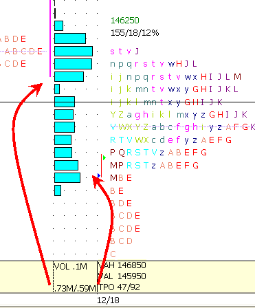
To add the cursor window, right click on the chart and select Cursor. The cursor window will be added to the bottom of the chart. TI contains information regarding Volume, Value Area High (VAH), Value Area Low (VAL), and Time Price Opportunity (TPO) count. Each letter, or TPO, on the chart represents a time bracket (normally a half hour increment). The cursor window displays the TPO count above/below the price in which the cursor has been placed. 
The volume reading in the cursor window indicates the volume for the selected bar as indicated by the cursor (.1m in the example above). In the example here, .73m indicates the volume above where the cursor is selected while .59m indicates the volume below the cursor.
Subscripts
Subscripts appear as small numbers next to the letters (TPOS) on the Market Profile chart. They are displayed when using an interval that is less than 30 minutes, and represent what portion of the 30-minute segment the price traded at. This feature can be disabled by selecting Market Profile Options, then Segment Properties, and then unchecking Show Subscripts.
Changing Colors
You can change the color of certain letters by selecting Market Profile Options, and then Segment Properties. From that window, you need to select the letter you wish to change the color of, and then select the foreground and background colors.
Point of Control
The Point of Control is a line that runs through a row of letters on the chart. It represents where the greatest number of letters exist and is also where the Value Area is based from. If more then one row is tied for the same number of letters, then the row with the highest volume is used.
How can I include more then one day in the same distribution?
You can combine distributions by clicking in the X-Axis of the data you wish to include, holding down your left mouse button, and dragging the data into the distribution you wish to include it into. To better illustrate, please see the below screenshots.
TPO Summary
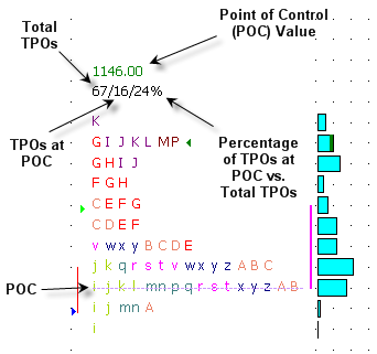
We’ve added a TPO Summary to the top of each distribution. This is comprised of 4 values... the green number at the top is the Point of Control, which is basically the price level that has the most TPO’s. The first number in the second row is the total number of TPO’s. The second number is the number of TPO’s at the Point of Control, and the third is the percentage that the Point of Control represents of the Total TPO’s.

To add, because of the way TPOs are created with a different letter for each 30 minute period, it's not possible to go with a larger interval than 30 minutes in a regular MP window. To get the results you want, you need to right click on the window and go to Segment Properties. In this dialog, you can set the lettering and coloring of each segment. If you make each segment on the hour the same letter and color as the segment on the half hour, it will be as if you have a 60 minute set of TPOs. When you do this and have an interval of 30 minutes or less, you'll get doubles of each segment since it's really 2 separate segments with the same label, but using it this way with a 60 minute interval will give you a single of each letter at each price.
Once created the way you want, you can either save this configuration as your default by choosing Set As Default in the Style Templates on the right click, or you can Save it as a separate template and give it a name such as 60 minute or something that makes sense. In that case, you'd still have the standard defaults for regular intervals and then could apply this template from the Style Templates menu any time you wanted to change an MP window to this configuration.
Merge / Unmerge Distributions with a Right-click
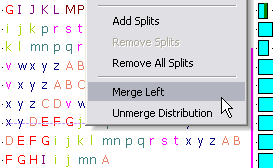
You can merge entire distributions quickly by right clicking on the distribution, and selecting Merge Left. Just as easily, you can unmerge a distribution by selecting Unmerge Distribution.

Segment Properties – Letter Adjustment
You can now adjust the letter for each time period. this allows the user to have multiple letters across the 24-hour time span. some prefer to have only a four letter sequence repeat every two hours (i.e. jklm). To do this you highlight the 00:00 a.m. letter, and type in the letter ‘j’ into the label area. Repeat this for each half-hour using the next letter i.e. k for 00:30, l for 01:00, etc.
Volume Marker for Closing Value
To more easily identify where the distribution closed, there is now a green bar at the end of the volume bar. The color of this is tied into the "Last" color in the Market Profile Properties dialog box.
Tips for using Market Profile
- Manually combined distributions can be saved/loaded from the page. These distributions may be easily separated on a case-by-case basis using the right-click menu. Previously users had to reload the entire chart, losing all distributions. In addition, manually combined distributions will now not ‘unmerge’ when the user scrolls back far enough to cause another data request.
- TPO Summary added to each session (toggled on/off through Properties). Shows price of widest TPO point, plus TPO count and its % of the day.
- Manually set tick increments/factors are now saved and loaded.
- The actual letter segments themselves can now be edited. Previously users could only shift them up or down.
Troubleshooting tips
Looking at the same symbols, in two Market profile charts with the same interval, why do the Volume bars look different? Is there an issue within the software?
The reason for this occurrence is due to the scaling of the chart, as mentioned above, if you Left click on the x-axis and Drag either left or right, you are compressing or expanding the data. Doing this will result in the volume bars changing shape to match that of the compressed/expanded information. This will also change the volume figures which are at the top of the market profile chart e.g. 0, 20K, 40K, 60K, 80K.
here is an example; they look like two different charts but in fact contain the same information.
