introduction to swamicharts test


How can SwamiCharts help improve my trading?
Ordinary technical indicator charts can provide too much precision with too little meaning. For example, you see precisely when a 14 period RSI crosses over 30 but does this always have the same meaning? Perhaps in one case (but not in another) a slightly different period tells an entirely different story. SwamiCharts provide additional insight because you are visualizing indicator differences as changes in color in the big-picture context of a range of lookback periods.
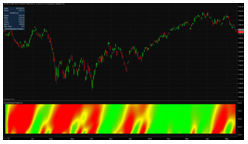
SwamiCharts are easy to understand, quick to interpret, and entirely consistent. SwamiCharts are a type of 3D chart with time on the x-axis (length), lookback period on the y-axis (height), and the indicator value (color) as the 3rd dimension.
An ordinary technical indicator line chart shows an indicator at a single fixed lookback period only, a very narrow view. SwamiCharts is an evolutionary step forward, providing a 3D heatmap view of a technical indicator over a wide sequential range of lookback periods. This type of heatmap visualization technology (also used in the medical imaging and mapping fields) is now possible using modern high-speed PCs with intelligent graphics cards.
Context provides insight. SwamiCharts provides context. A quick scan of the shorter period (lower y-axis) lookback values clearly gives an early indication of when a new indicator pattern first begins to emerges within the longer period (upper y-axis) big-picture context. Pattern continuation and dissolution can now clearly be seen by scanning the longer lookback periods.
Click here to add SwamiCharts studies to your eSignal subscription ($40 per month).
Support:
Additional information can be found on the SwamiCharts website.
For a discussion on Mesa Indicators, please visit the SwamiCharts Forum on eSignal Support Forums.
You may also want to join the SwamiCharts File Share group.