Entering Symbols Strategies, Alerts, and More
Editing Columns, Comments and Headings
Properties Menu
The Dashboard is a feature which allows traders to conveniently monitor a portfolio for the current condition of the market on different time frames based on a selected Advanced GET strategy.
The Dashboard window displays colored gauges or bars that indicate the status of a strategy for periods ranging from intraday, daily, weekly, monthly default time frames. The window also has text boxes on the left to enter symbols. When you double left-click on a gauge or bar, a chart with the relevant time frame and the studies associated with the strategy being monitored by the dashboard will be displayed.
To open a Dashboard window, click New on the main menu bar and select Dashboard from the dropdown menu.

The Dashboard Window
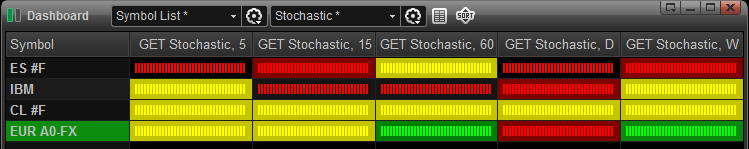
The Dashboard has two display modes, the default Gauge Mode and the Bar Mode.
To change the display to Bar Mode, click Properties in the Dashboard window, highlight Default Cell, and uncheck Display Strategies as Gauges. To apply the Bar Mode to the Dashboards on the current page or all other open pages, click Apply To... and select to Apply to All Pages or Current Page and click Close when finished.
Gauge Mode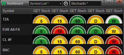
Bar Mode
Entering symbols, strategies, alerts and more
To enter a symbol into the Dashboard, left-click in the Symbol box.
You can also select a Symbol List from the dropdown menu.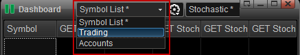
Once you have entered the symbol(s) you wish to track, the different gauges or bars will light up red, green, yellow, or gray signifying the state of the market according to the selected dashboard strategy, as explained below.
Selecting Dashboard Strategies
The first time you open the Dashboard, the default Strategy will be the GET Stochastic. Every subsequent time you open the Dashboard, the last selected strategy used will be applied.
You can change the Dashboard strategy by selecting a strategy from the dropdown menu on the title bar. 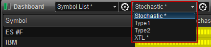
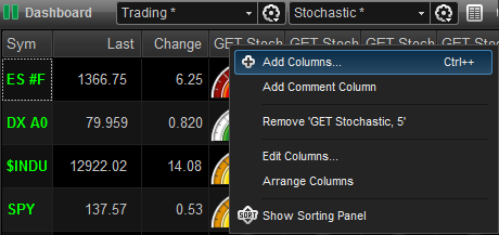
You can add multiple strategies to a Dashboard. For example, you can add a Type 1 Strategy column to the existing GET Stochastic strategy columns, by right-clicking on the column header where you want Type 1 column be inserted and selecting Add Columns. left-click on the Strategy tab and select Type 1, for example. 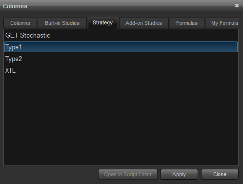
Click the Apply then Close buttons. The Type 1 column is now on the Dashboard: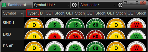
Strategy Descriptions
Stochastic Strategy: Is designed to indicate when the market is overbought or oversold. The False Bar indicates the presence of a strong trend and that the standard overbought and oversold signals should be ignored.
If a Dashboard gauge or bar is green in color, then the market is considered oversold. If a dashboard gauge or bar is red in color, then the trend is considered overbought. If a dashboard gauge or bar is yellow in color, the market is between the overbought and oversold levels, therefore, neutral. If a green or red gauge or bar has a white border, a False Bar is present and the current signal should be ignored.
Type 1 Strategy: Is a trend-following strategy used for considering taking a position at the end of a Wave 4 Retracement in the direction of the current trend. Four parameters must be met for this strategy: (1) Wave 4 is completed; (2) the Elliott Oscillator has pulled back a minimum of 90% and a maximum of 140% of its peak during Wave 3; (3) the PTI is greater than 35; (4) Wave 4 Channel Lines have not been exceeded in price or time.
If a Dashboard gauge or bar is green in color, then the parameters for long position have been met. If a Dashboard gauge or bar is red in color, then the parameters for short position have been met. If Dashboard gauge or bar is yellow in color, then the Type 1 Strategy parameters have not been met.
Type 2 Strategy: Is trend-reversal strategy for considering taking a position in the opposite direction of a completed trend. Two parameters must be met for this strategy: (1) Wave 5 is completed; (2) there is a divergence of the Elliott Oscillator between the Wave 3 peak and Wave 5 peak.
If a Dashboard gauge or bar is green in color, then the parameters for long position have been met. If a Dashboard gauge bar is red in color, then the parameters for short position have been met. If Dashboard gauge or bar is yellow in color, then the Type 2 Strategy parameters have not been met.
XTL Strategy: The XTL (eXpert Trend Locator) is a Strategy that indicates whether the market is trending up or down, or is in a non-trend mode. It uses a statistical evaluation of the market to tell the difference between random market swings (noise) and directed market swings (trends).
If a Dashboard gauge or bar is green in color, then the trend is up. If a Dashboard gauge or bar is red in color, then the trend is down. If a Dashboard bar is yellow in color, the state is neutral, as there is no perceived trend. If there is not enough data, then the gauge bar will be gray with a white rim.
Displaying a Chart for a Dashboard Symbol
To display a chart for a symbol entered in a Dashboard window, left-click on the bar for the time frame desired. A chart will appear with the relevant Dashboard Strategy studies for the time selected.
Sorting Columns
Columns can be sorted by symbol (in alphabetical or reverse alphabetical or, by last trade price, change from previous close and by strategy time interval. Sorting the strategy intervals is especially useful if you have a long list of symbols on the Dashboard and you want all buy signals or all sell signals for that interval at the top of the list.
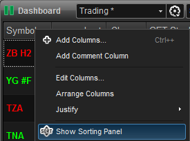
Right-click anywhere on the columns header bar and select Show Sorting Panel.
Columns can also be sorted by strategy buy or sell signals by left-clicking strategy column header. A sort icon (triangle) will appear in the column header and you can toggle the selected column to be sorted in ascending or descending order or group strategy buys or sells at the top or bottom of the list.

Adding Alerts
You can add an alert to when a strategy signal changes to a buy or sell. Right-click on the header bar and select Edit Columns. Left-click on the Alerts tab:
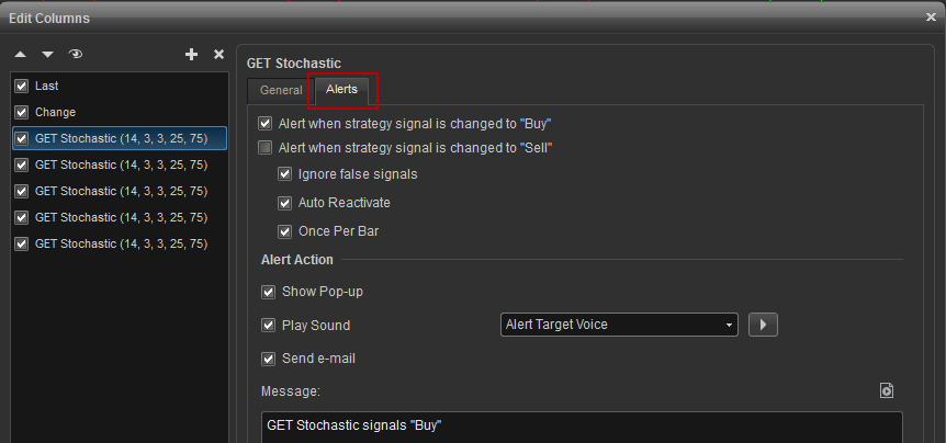
Alert when strategy signal is changed to "Buy": Alerts you when a gauge or bar changes to green from red or yellow.
Alert when strategy signal is changed to "Sell": Alerts you when a gauge or bar changes to red from green or yellow.
Ignore false signals: If checked, an alert will still be triggered if a False Bar is present. (GET Stochastic strategy only).
Auto Reactivate: Automatically resets an alert to fire again when the alert conditions reappear.
Once Per Bar: Limits the firing of the alert to the current bar and will require a new bar to fire again.
Alert Action: Select how you wish to be notified when an alert has been fired.
Show Pop-up: Displays a pop-up window when an alert has been fired.
Play sound: Play a selectable sound when alert has been fired.
Send e-mail: Select to send you an e-mail when alert has been fired.
Message: Create a custom message to be displayed in the Alert Notification window and the Alert Log window.
Moving, Adding to or Removing Columns
To move an existing column from it's present position, left-click on the column's header and drag it to the desired location.
To add a new column to the Dashboard window, right-click the mouse on an existing column heading and select Add Columns to open the list of available columns.
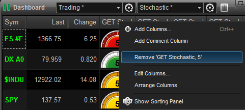
To remove a column, right-click on the column header to be removed, select Remove [column name].
 and select to Save or Save As.
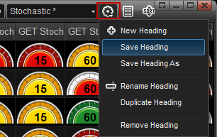
Adding Comments
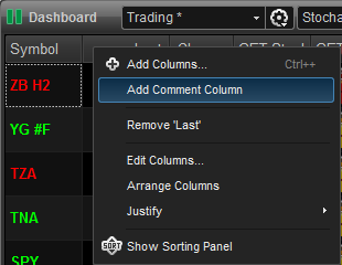
To add the Comment column, right-click on a column heading where you want the Comment column placed and select Add Comment Column from the dropdown menu.
Editing Time Intervals and Parameters
To edit time intervals and parameters, right-click on the header bar and select Edit Columns. By default, the General tab will be displayed and for the GET Stochastic strategy you can edit the parameters and intervals, whereas with the Type 1, Type 2, and XTL you can edit the time interval only.
Displaying a Chart for a Dashboard Symbol
To display a chart for a symbol entered in a Dashboard window, double left-click on the dial or bar for the time frame desired. A new chart will appear with the relevant dashboard strategy studies for the time interval selected.
To link an existing chart to the Dashboard, click on the symbol and linking icons on the Chart and Dashboard windows and select the same color for the links: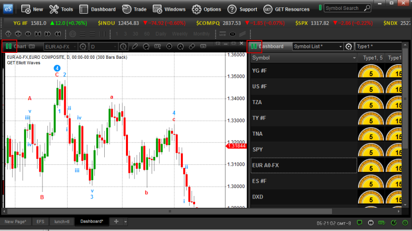
A single left-click on a dial or bar can now be used to display the chart.
Dashboard Properties
The Dashboard Properties dialog box can be displayed by either left-clicking Dashboard on the main menu bar and selecting Properties or right-clicking anywhere in the Dashboard window and selecting Properties.
Default Cell
The Default Cell dialog box allows you to specify the font type and size along with a button for bold and italics. There are color settings which include Text and Background. Check Background #2 if you prefer alternating colors for each row. Additionally, you can edit the text and background colors for triggered alerts. Unchecking Display Strategy as Gauges, will change the Dashboard display to Bar Mode.
symbol field
change fonts, colors, and toggle between displaying the symbol or description of the listed issues. background #2 is checked if you prefer alternating colors for each row. you can opt to show symbol as description which will display the description instead of the symbol. 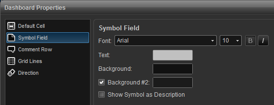
Comment Row
The Comment Row dialog box allows you to specify the Font type and size along with a button for bold and italics. Text and background colors can be edited here as well. 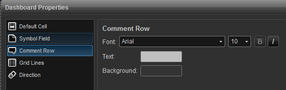
Grid Lines
Use this dialog box to add vertical and horizontal grid lines and to customize the grid line color. 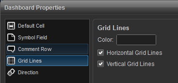
Direction
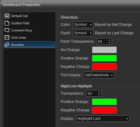
Color: Allows you to choose to color the values in the cells by based on Net Change. You can select apply to color to all cells, none of the cells or specify the Symbol, Last, Change columns only. The defaults are green if the Net Change is positive, red if it is negative or gray if no change. You can customize these colors.
No Change: Change color for default gray color to custom color for no change.
Positive Change: Change color for default green color to custom color for positive change.
Negative Change: Change color for default gray color to custom color for negative change.
Tick Display: Allows you to toggle between using arrows or +/- for price changes that are up or down.
High/Low Highlight: Highlights the High and Low and/or Last fields when a new High or Low value is hit for the day.
Transparency: Allows you to set the level of transparency of the highlight (ie, from very dark to very light).
Positive Change: Change color for default green color to custom color if high is made.
Negative Change: Change color for default green color to custom color if low is made.
Display: Select which column to highlight (High, Low, Last) or no highlight (Don't Highlight).