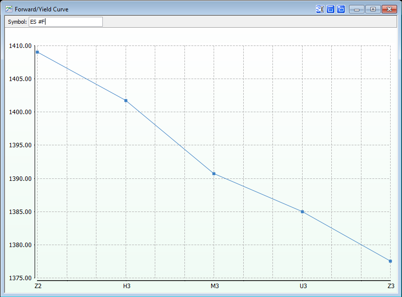
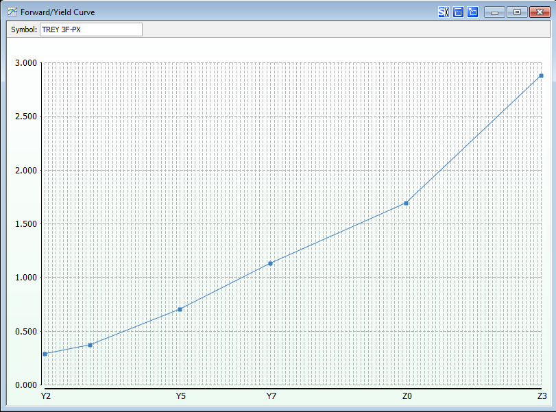
Forward Curve charts provide the user with the ability to view pricing on forward contracts for commodities and can act as unbiased predictors to allow the user to better see where the market is trending. The X-axis plots the contracts by expiration month (from oldest to newest) while the Price is displayed on the Y-Axis. New to 11.5 is the ability to look at these curves historically.

yield curves
yield curves are typically used to verify the "shape" of the economy…quite literally, actually. if a normal yield curve is present, long-term investors are rewarded with a higher rate of return, and short-term bonds will be a lower yield. when an inverted yield curve is present (higher yields for near-term), the market at large is in an unusual state, and a cautionary approach when investing is warranted.

there are three common shapes of a yield curve:
1. Normal: The rate of return for long-term bonds is higher than short-term bills. Typically, this is a rounded parabolic shape showing that, the longer the time to maturity, the greater the yield.
2.Inverted: This shape occurs when long-term investors are fearing that the markets are primed for a significant down turn and need to capture these perceived high interest rates while the getting is good. Because of the laws of supply and demand, this rush in snatching up long-term securities causes the price to go up. The yield, by its nature, is indirectly proportional to the bond's price, and, as a result, the yield heads lower. If the long-term yields are less than the short-term yields, an inverted curve appears.
3. Flat: The flat yield curve is pretty self-describing. This occurs when the short-term and long-term bond investors are approximately rewarded the same yield. This signals a period of uncertainty because the markets have not fully processed a potential change in trend.
The last time a flat yield curve occurred was just after the inverted curve took place; specifically, this occurred between April and October of 2007. Certainly, this was a period of confusion because the bond market was saying one thing while the Dow and S&P500 continued their upward climb. As many technical chartists know, divergences such as these typically indicate a significant change in market direction.
Note: This chart type is based on intraday data so you must subscribe to either real-time or delayed data for these charts to populate.