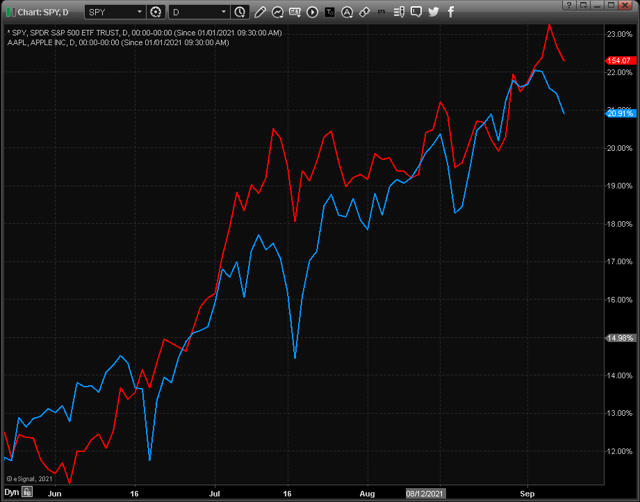
eSignal 12 Series - Performance Mode Chart
This mode sets the Chart Type to Line and returns the value of each symbol as a percentage change calculated starting from a specified date. This is particularly useful when making a precise comparison of the relative strength of multiple symbols.
This mode sets the Chart Type to Line and returns the value of each symbol as a percentage change calculated starting from a specified date. This is particularly useful when making a precise comparison of the relative strength of multiple symbols.
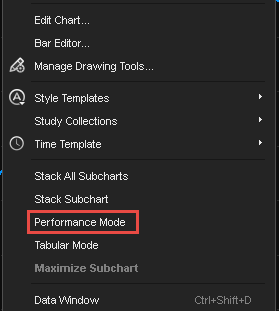
To enable this feature, right click on the chart and select Performance Mode.
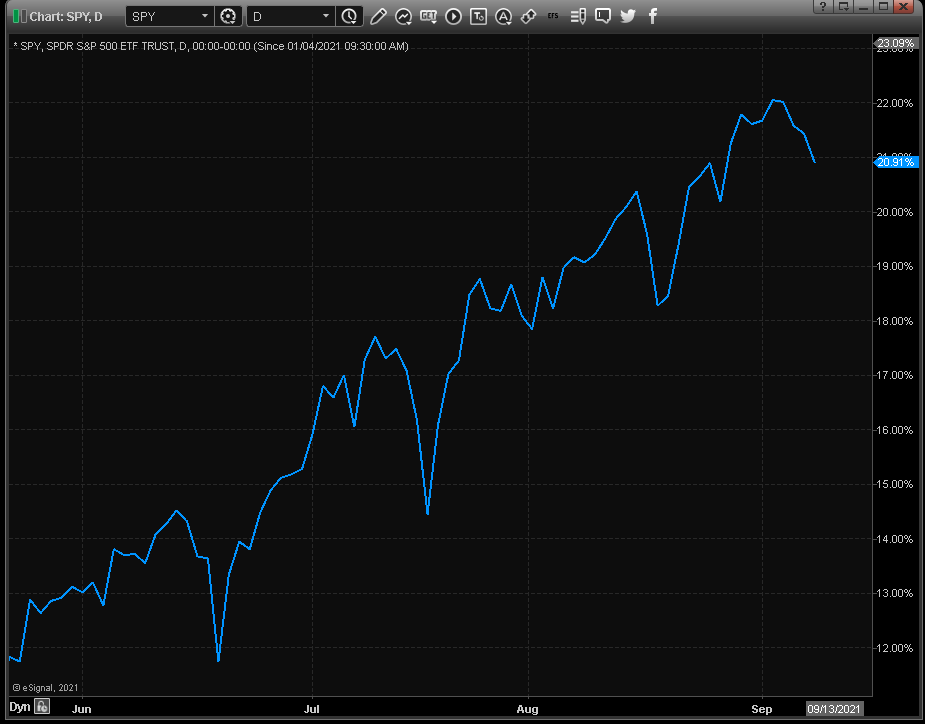
The Chart Type automatically changes to a Line Chart and also, the price scale changes to a percentage scale. (We will use SPY as our example symbol).
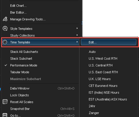
to specify a start date for the chart, right-click in the chart window and highlight time template, then select edit.
click on the + icon in the upper lefthand corner of the window. input a name in the name field . in this example, we will use ytd since we want to display the performance since the beginning of the year. next, we will select start date/time and enter 01/01/2021. lastly, we click the close button.
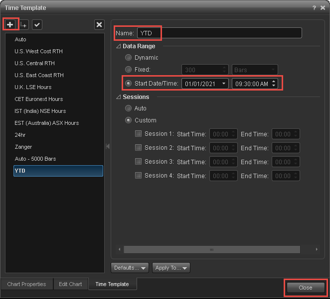
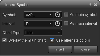
to compare the performance multiple symbols such as aapl to spy, right-click on the chart and select insert symbol (aapl, for our example) and check the box to overlay the main chart:
After inserting AAPL, we can now compare the performance for 2021 of SPY (blue line) and AAP (red line).
