Swami Charts Studies
Success with ordinary indicators is highly dependent on parameter settings. Does it make sense to always use the same ones? Will backtesting improve my results? How far back should I test? These questions persist.
The Swami A/D indicator is a measure of net money flow into or out of the market. Accumulation is indicated as green and distribution is indicated as red, with black indicating roughly equal money flowing into and out of the market.
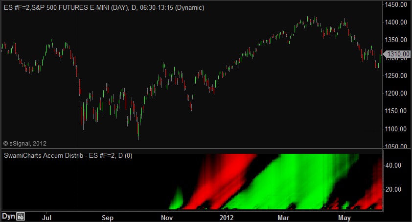
Every transaction obviously requires both a buyer and seller. However when prices are increasing on increasing volume, the bulls are predominant (and vise-versa). Due to its' volume component, the SwamiCharts A/D can sometimes spot large institutional investors getting into or out of the market ahead of big price moves.
SwamiCharts A/D computes the average difference between the closing and opening prices each day multiplied by the volume for the day. As with all SwamiCharts, the algorithm is computed over a range of lookback periods.
In the example for ES above, distribution begins about mid November 2011 and continues until the last week of December. This distribution continues until the last week of December 2011, whereupon accumulation prevails for the remainder of the uptrend.
SwamiCharts Convolution
A DSP algorithm to help you nail turning points
Swami Convolution shows price turning points as red and green plumes. To determine whether a turning point represents a peak or valley, locate the onset of a plume at the bottom of the chart and go back in time a few bars to locate the most recent peak or valley. Red indicates a peak, implying a following downturn. Green indicators a valley, implying a following upturn.
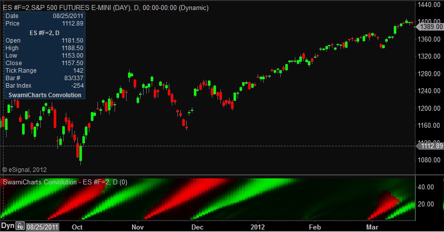
Convolution is term used in the engineering field of digital signal processing (DSP) to the measure of overlap of one function as it is shifted against another. Swami Convolution shifts the inverse time series of prices relative to the observed time series of prices over a range of lookback periods. Performing the computation this way, the two functions become highly correlated at major price turning points. As a result, Swami Convolution can often identify major turning points with only a few bars of delay.
SwamiCharts Intraday Fisher
A SwamiChart for intraday trading
The Swami Intraday Fisher indicator is an indicator for short time frames of 5-15 minutes. As with other "stoplight" SwamiCharts, green is a bullish indication, red is a bearish indication, and yellow is indeterminate.
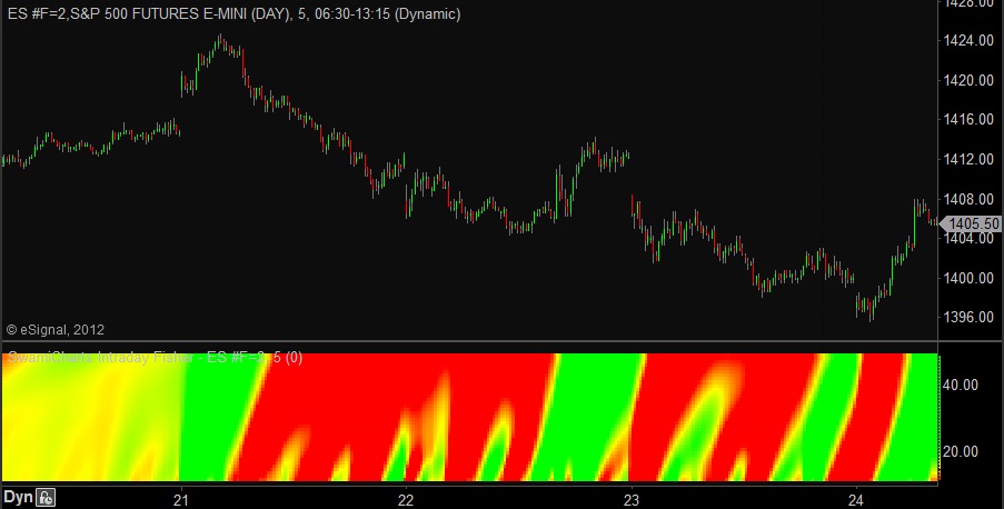
The above chart shows the ES using 5 minute data. Multiple short-term directions were accurately portrayed.
SwamiCharts Intraday Impulse
A SwamiChart for intraday trading
The Swami Intraday Impulse gives a fast-acting notification of changes in intraday prices. Transitions from red to green are bullish and from green to red are bearish. Yellow is indicates a transitioning or indeterminate condition.
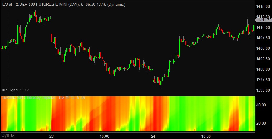
In the chart above, we see the 5 minute prices for ES. Several intraday movements, both up and down, were correctly identified with actionable signals.
SwamiCharts Intraday Volume
A volume indicator for intraday timeframes
Swami Volume shows volume relative to its recent average. Higher relative volume is shown in white and lower volume is shown in blue. This indicator has been optimized for intraday timeframes.
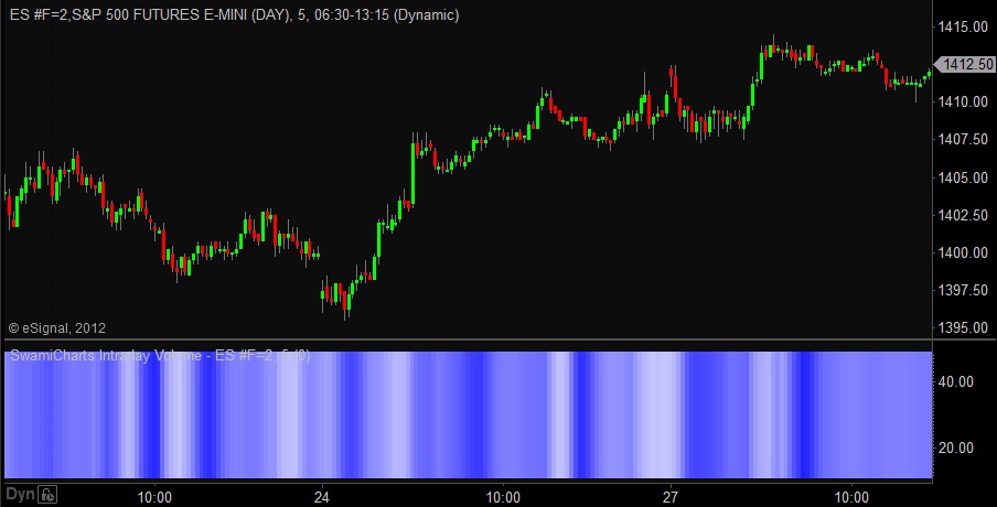
The Swami Intraday volume has been characterized for immediate action. This indicator is similar to its cousin the SwamiCharts Volume except that it is faster acting and generally more appropriate for intraday timeframes.
Be aware of the sharp volume increases in intraday charts that occur as the 24 hour markets begin to open in various parts of the world. This is especially seen in the Forex and Globex markets for the equity indexes.
SwamiCharts Laguerre Trend
An early trend detector that can minimize whipsaws
SwamiCharts Laguerre Trend can often identify the onset of trend without the whipsaws that occur in other trend indicators. Uptrends are indicated in green, downtrends are indicated in red, and yellow is indeterminate.
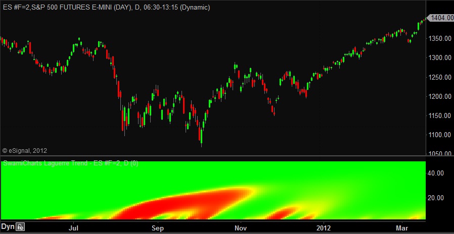
Laguerre polynomial filters were described by SwamiCharts co-founder John Ehlers in his book Cybernetic Analysis for Stocks and Futures. The basic idea is to create the equivalent of very long filters using a relatively small amount of data so the filter would be responsive to data changes. SwamiCharts Laguerre uses real filter lengths over the range from 12 to 48 bars to create the equivalent of much longer moving averages. As a result, the onset of trends can often be clearly identified without whipsaws.
In the example chart for ES above, SwamiCharts Laguerre would have kept trend traders in the uptrend for the right two thirds of the chart.
SwamiCharts Market Mode
Is the market trending up, trending down, or swinging?
The SwamiCharts Market Mode indicator shows you whether a security is in trend mode or swing mode. Green indicates an uptrend and red indicates a downtrend while yellow indicates trading within a range (i.e., support-resistance channel or swing mode).
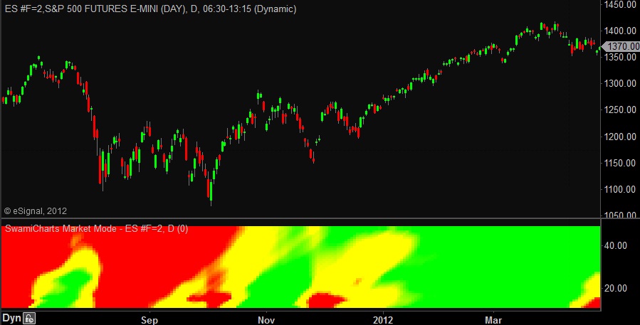
SwamiCharts Market Mode operates by measuring the direction and slope of then trend across a cycle period and comparing this slope to the peak-to-peak amplitude swing of the cycle across the same period. The cycle period ranges from 12 to 48 bars, and is scaled on the vertical axis. If the ratio is greater than one (green), an uptrend is indicated. If the ratio is less than minus one (red), a downtrend is in effect. If the cycle amplitude is greater than the absolute value of the trend, the cycle mode is indicated. The swing mode has the most effectiveness for swing trading. An uptrend is indicated by green, a downtrend is indicated by red, and the swing mode is indicated by yellow.
SwamiCharts Predict
Prediction is difficult, but SwamiCharts Predict can help
While similar to classical price oscillators, SwamiCharts Predict can often be 2 to 4 bars earlier. Green indicates a bullish condition, red indicates a bearish condition, and yellow is indeterminate.
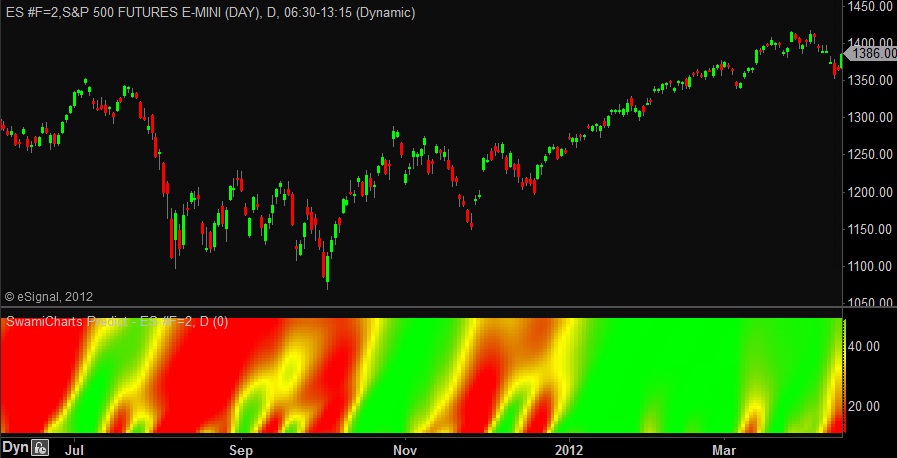
SwamiCharts Predict is a momentum oscillator that measures the speed and change of price movements using advanced digital signal processing (DSP) filtering techniques.
SwamiCharts Predict gives you an early view of the change of price movements by varying the calculation period over a range of periods and displaying price movement to the upside in green and price movement to the downside in red. As a result you see both the early stages of a price movement for the shorter periods and a measure of the persistence of the movement for longer periods toward the top of the chart.
SwamiCharts Relative Performance
View the performance of one security compared to another
SwamiCharts Relative Performance shows the relative price performance between a pair of securities. When the plotted security is outperforming the base security, the indicator is green. When underperforming, the indicator is red. Yellow indicates the securities are performing equally.
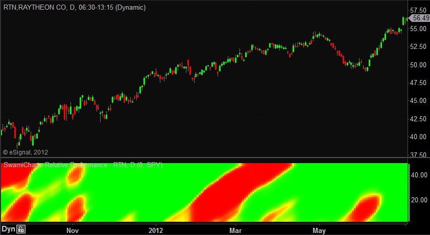
Note that Swami Relative Performance is not the same as an RSI indicator. Swami Relative Performance simply measures the price movement of one ticker symbol against another. The comparison is made over a filter span from 12 to 48 bars.
In the above example the base security is SPY, the overall S&P 500 market. We see that RTN was underperforming the S&P during the first quarter of 2012 although the stock was in an uptrend.
SwamiCharts SwingWave
A SwamiChart for visualizing short-term wave crests and troughs
This indicator shows the cyclic price swings at multiple lookback periods. Blue sections indicate wave troughs (valleys) and orange indicates wave crests (peaks).
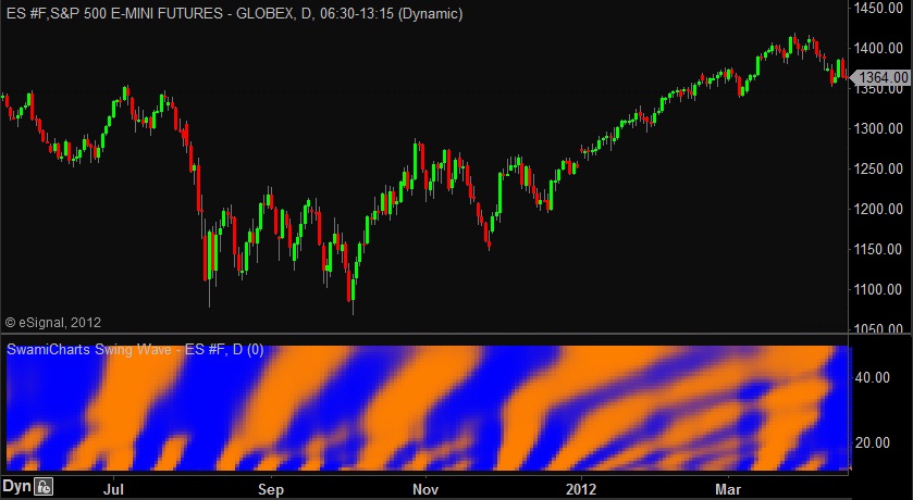
SwamiCharts SwingWave uses advanced DSP cycles-measuring techniques to extract only the short-term wave components from price data. Wave peaks are displayed in orange and wave valleys are displayed in blue. Lookback periods from 16 to 48 bars are displayed on the vertical axis. This indicator is often able to detect wave peaks and valleys with only 2 or 3 bars of delay.
SwamiCharts Volatility
A clearer picture of price volatility
The SwamiCharts Volatility indicator gives you a clearer picture of price volatility. Periods of high volatility are shown as lighter shades of blue while periods of low volatility are in darker blue.
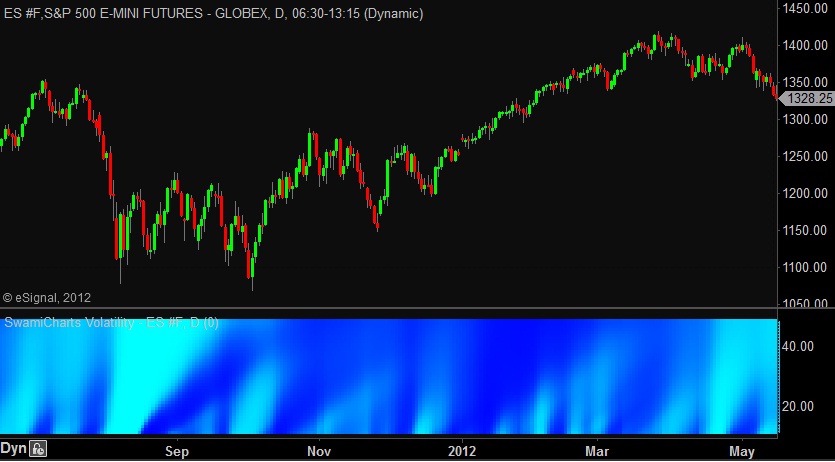
Swami Volatility gives a clear picture of volatility by comparing the current true range of price movement to the average true range over a range of filtering periods from 12 to 48 bars. Higher volatility is indicated in light blue and lower volatility is indicated in darker blue.
In the example chart above for ES above, the volatility was huge during the downturn in August 2011. Then, during the 2012 recovery there were sporadic short term bursts of volatility.
SwamiCharts Volume
A better view of how volume can precede price moves
SwamiCharts Volume shows volume relative to its recent average. Higher relative volume is shown in white and lower volume is shown in blue.
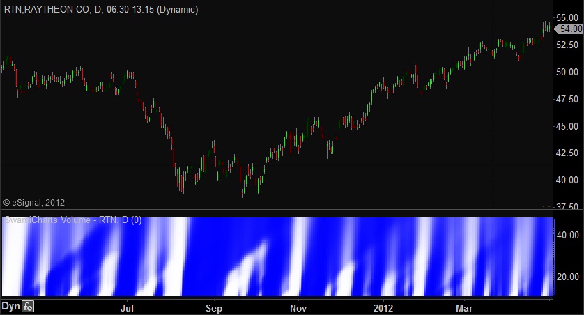
Unlike a traditional volume bar chart, the SwamiCharts Volume shows smoothed volume deviations from recent averages. The net effect of this is to make abrupt volume changes easier to perceive whether or not the absolute volume is high, low, or in-between. Swami Volume produces a clear picture of the often complex relationship where volume often leads major price movements.